Lapsus Records
VINT
Design by Basora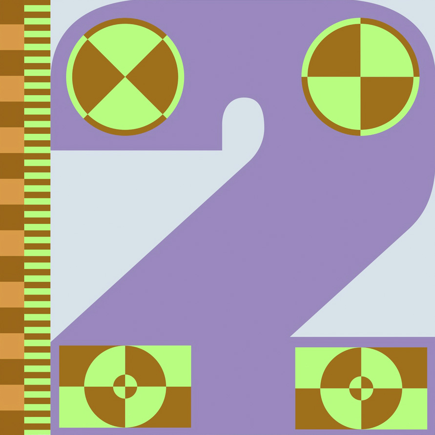
Basora is an independent design studio based in Barcelona. Founded in 2008 by Josep Basora, the studio creates simple yet powerful graphic solutions for international brands and individuals across print, digital, and motion. We spoke with Josep about simulating colourblindness and his 'crash test dummy' inspired design direction for VINT (Catalan for “twenty”), a compilation record created to mark the 20th anniversary of Lapsus Records.
Released by Lapsus Records (2024)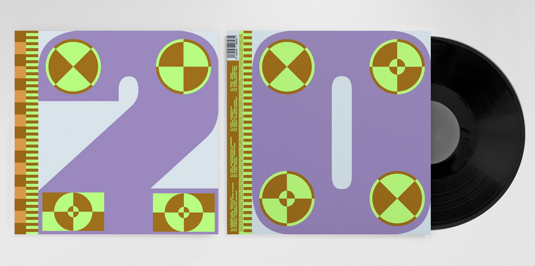
Hello. Please tell us about the brief and commission. Josep: The brief was very clear: to design a compilation celebrating the 20th anniversary of Lapsus Records. I’ve known them since the very beginning. Over the years, it’s been a long-term collaboration, designing everything from flyers and communication assets to vinyl records and merchandise.
Albert Salinas, aka Wooky, is the founder of the label, as well as a DJ and music producer. Lapsus didn’t start as a label, they began by organising electronic music parties. I met Albert at the very first Lapsus party, and we’ve been good friends ever since. That’s 20 years of friendship. :)
When I design for Lapsus, I usually have total freedom. They provide the artist’s name, title, and music, and then I design. Most of the time, they like what we create. Lapsus is a very small record label, pressing between 300 and 1,000 copies of each release. The design budget isn’t huge, which is why we agreed that I could have the freedom to create whatever I want.
How did the music inspire the creative process?
Josep: When I looked at the compilation of artists featured on VINT, the tracklist felt very eclectic, ranging from Kode9 to Suzanne Ciani. Because of that, it didn’t need to look like a pure techno record, or an ambient record either. Instead, we wanted an experimental tone.
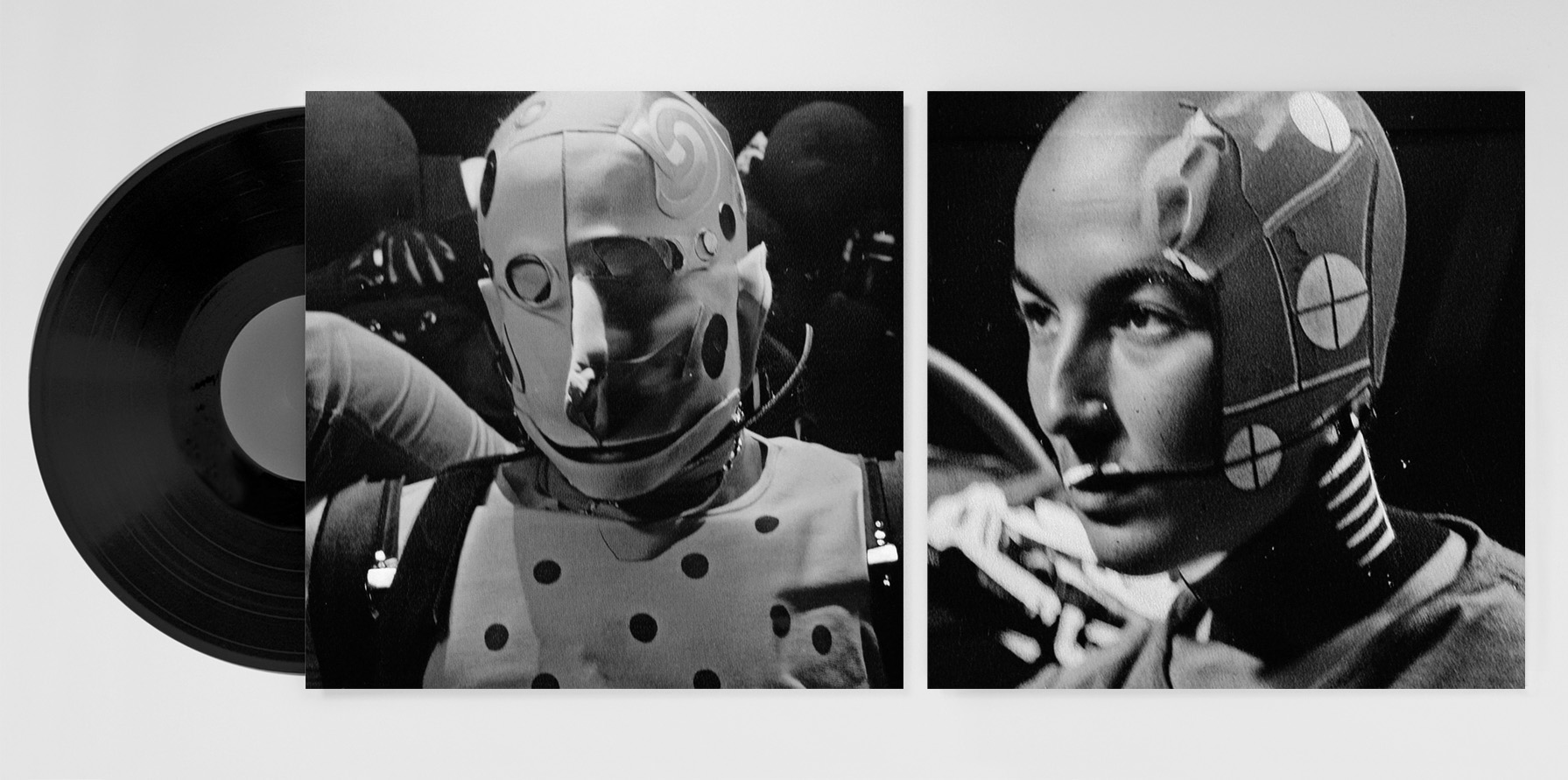
During the brainstorming sessions, we discussed how to represent 20 years of running Lapsus: trying to sell electronic music records, producing festivals, and more recently, representing artists for live acts. Running a label is always a test—you try new things, and sometimes they work, sometimes they don’t. Over these twenty years there have been both successes and failures, the experiments that didn’t go as planned. That's why we proposed the idea of using crash test dummies, because running a label often feels exactly like that. Sometimes you get it right, sometimes you don’t. The geometric shapes and inner sleeve photos all stemmed from this concept.
Choosing the colours was a special part of the design process. Albert from Lapsus is colourblind, and he fully trusts my judgment when it comes to choosing colours. It’s funny, sometimes he’ll ask me: “Is this one blue? Or is it green?” Since this compilation celebrates his 20-year project, we thought it would be interesting to incorporate something personal, relating to colour blindness. There are websites that simulate how colourblind people see (pictured below), so we uploaded the design with the colours we liked, then used the altered result as our reference palette. People with colour blindness often perceive many tones as light brown, while others appear extremely saturated. That’s why the final combination feels a bit unusual, but we loved it—and it also came out of a random process, which we enjoy. It keeps us from overthinking decisions. :)

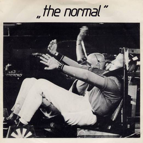
What did you research when developing ideas for artwork?Josep: We began by looking at reference images of crash test dummies. I was also inspired by a cover and video from Daniel Miller’s 1980s project, The Normal (pictured above). His track Warm Leatherette features a black-and-white image of a crash test dummy on the cover, which influenced our approach. That’s why we gave the inner images a retro feel, as if they had been taken in that era.
Please share an insight into the design development.
Josep: The production process was straightforward. We didn’t want to add too many special finishes, and felt that CMYK plus a fluorescent Pantone would be more than enough. We didn’t test the combination beforehand, and I'll confess we were a little nervous to see the final result. But it worked beautifully. We loved how the light brown shade interacted with the fluorescent colour.Design by Basora
Buy the Lapsus Records 'VINT' 20th anniversary compilation vinyl here
© Transmission Publishing (2025)