Over/Shadow Records
Design by Gary Haslam and David Kirby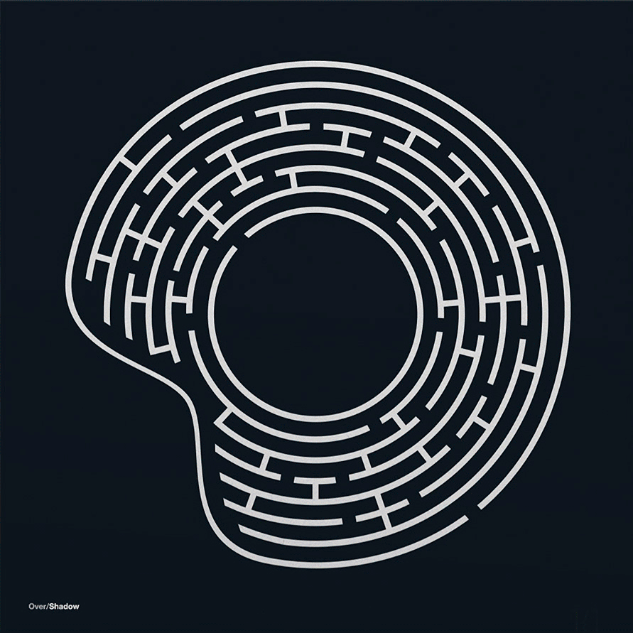
Over/Shadow is a British dance and electronic music label. Founded in 2020 by Si Colebrooke and Sean O’Keeffe, originally of Moving Shadow, releasing peak era 1990's rave and hardcore, jungle and drum’n’bass, they were later joined by Gary Haslam in 2021. We spoke to Gary about the evolution of the signature Over/Shadow front cover branding, and David Kirby about the maze design for Decoder (aka Darren Beale and Mark Caro) 4 Track EP.
Released on Over/Shadow (2024)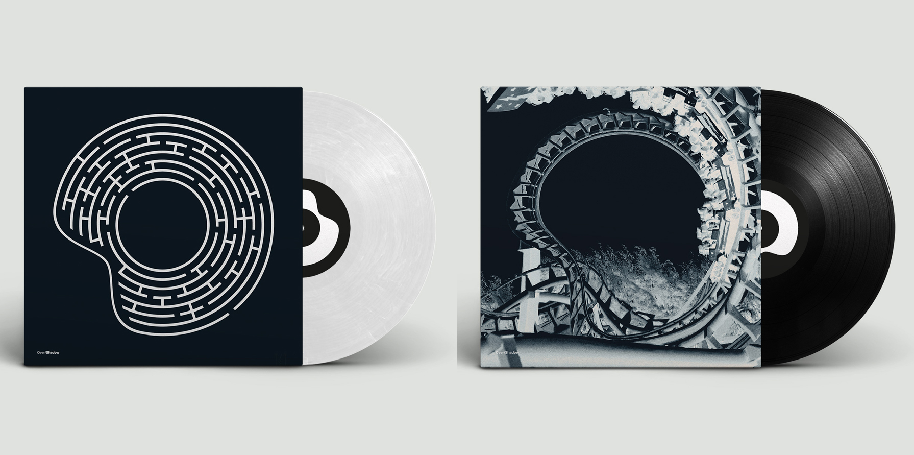
Hello. Please tell us about the brief and commission. Gary: Over/Shadow's first release was by Conrad Shafie aka Blame in 2020. I was brought in to help out in 2021, having worked previously with Sean (O’Keeffe) and Si (Colebrooke), for Moving Shadow way back in the late 1990s. I was part of the ‘core creatives’ and the last design I’d created for the label was Omni Trio's Cut Out Shapes back in 2012. So, after a long break (and over 140 12"s and 30 odd albums) it was great to start again with the old crew.
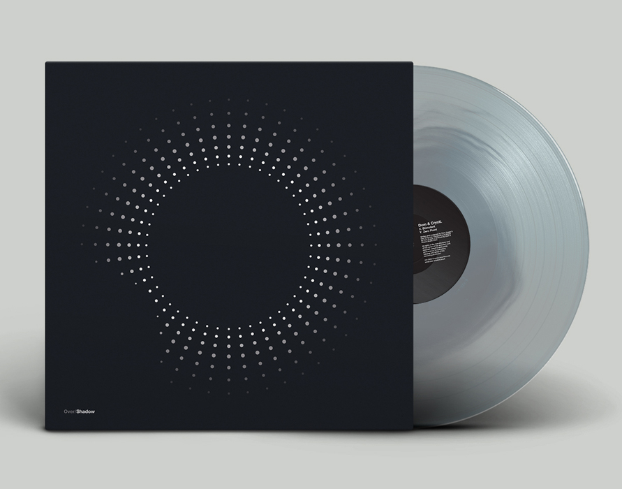
The crazy idea to reinterpret the disk logo on the cover of every release, while also representing the music, was created by Craig Thomas and Sean O’Keeffe. I came in for OSH006 Technical Itch's Another Life/Melt, so there were already five different interpretations of the logo, that had set the precedent. The brief was simple... do whatever you like!
The bar had been set with those initial five releases. OSH001 Blame's Lift Off, was Over/Shadow's first release, created by Sean, and was followed up with OSH002 Dom and Roland's Gasoline / Sundown and OSH003 DJ Tax’s Lost in You, both designed by Craig. My challenge was to create a new style or idea that will work with the logo. How far can we push it, yet still meeting the brief of designing to the logo.
We tried dots, lines, paint, fish, graffiti... and then there’s the reverse of the vinyl, which also saw a variety of treatments. Again, seeing how far we can push it. One example being the Technical Itch Fate Walker album, featuring a circular rock on a black sand beach. I had the idea to invert the rock for the reverse, however Si asked me to extend the front image onto the back, which was a challenge, as the back didn’t exist. The original stock images used to create the cover was square. So, the reverse was created from scratch in Photoshop using a multitude of stock images. And just to note, no AI apps or software were ever used on any of the sleeve art!
How did the music inspire the creative process?
David Kirby: This felt like the right time to have a bit of fun. With Decoder back on Over/Shadow, we wanted the sleeve to nod to his dark, minimal style but also do something a bit different. So, on the front: a maze. Clean, stark, much like the tracks themselves. Flip it over and you’ll find a dot-to-dot version, a looser and more playful take. It’s actually the first interactive sleeve we’ve done for Over/Shadow! You can try and escape the maze, then join the dots on the back (pen optional, patience recommended).
Gary: I rarely get the tracks to listen to before starting the artwork. And, to be honest, I don’t think it would influence the design. However, sometimes we get a track name with a visual connection that gives you something to work towards. The Abstract Drums Just a Ride EP was a rare occasion where I was asked to come up with ideas that had rollercoasters as a theme. All Photoshop work. No AI.

What did you research when developing ideas for artwork?Gary: I’ve been inspired by all manner of designers and labels. The Designers Republic, Build, Tomato, North, Stylorouge, Territory Studios. Nick Purser and Gareth Jones for Good Looking. John Black for Metalheadz... This list could go on and on.
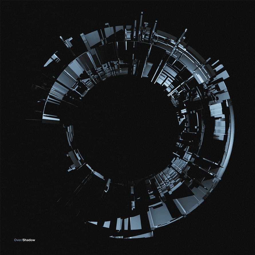
I’ve also designed for lots of different agencies and companies who needed different design skills and outputs, so it’s been great to try different approaches for the Over/Shadow sleeves. For example, the minimal vector line work detail for OSH006 DJ Trax Polar Opposite EP to the photographic manipulation for the ASC/Dom/DJ Trax albums, to the FUI (Future User Interface), HUD (Heads Up Display) which is inspired by Quadrant releases.
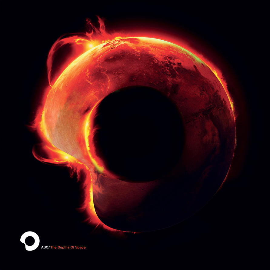
The trickiest, but my favourite Photoshop outcome, is for the Technical Itch Fate Walker album. The process becomes a mix of thinking. What could work for the logo? Could the logo turned into a planet, like the ASC The Depths Of Space LP, or made out of rock. I’m then off finding stock imagery and assets to try and make sense of what’s in my head. Some ideas take a long time to get right, others just happen with exploration and accidents when trying out ideas.
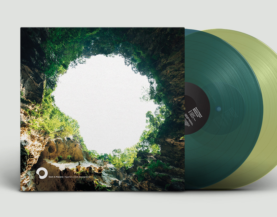
Most of cover ideas for Over/Shadow releases have been developed by myself, Dave, Sean and Craig, however some have been ‘assigned.’ For example, Dom and Roland's Against a Dark Background LP followed the same trees and nature theme throughout, later becoming the jungle sink hole against a dark background. This style was very much suited to Dom, however, Dave (DJ Trax) saw the idea and wanted to use it for his Break from Reality album. So, we explored ideas and shared them between us, with some or little direction, that naturally evolved into what we have now. Some have been used, whereas others remain in Si’s back pocket for future releases.
Please share an insight into the design development.
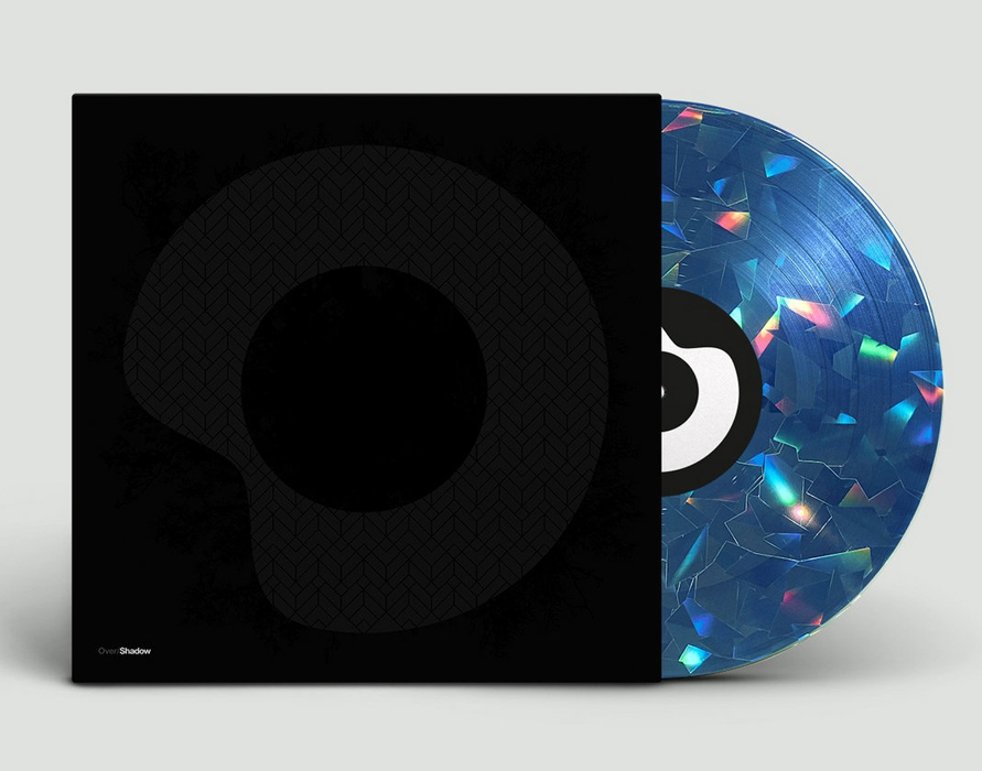
Gary: The sleeves explore a range of techniques and packaging. From 1 or 2 colour Pantones, metallics, to CMYK, to spot glosses and black ink on black, usually on reverse board. The Over/Shadow Quadrant Boxset pizza box concept came from conversations between Si and Sean, on how to package the 4 pieces of vinyl. This worked a treat. There’s also the vinyl. Different colours, transparent and black, reverse printed and, of course, Sully / Dom & Roland's Holographic 12" with hologram that Si laboured over to get right.Design by Gary Haslam and David Kirby
Buy the Decoder '4 Track EP' vinyl and other Over/Shadow releases here
© Transmission Publishing (2025)