IR_
Threnode EP
Design by Geometric Love
Geometric Love is a Brighton, UK, based graphic design and image making studio, founded by Steve Hyland, creating work for clients in the culture, entertainment and music industries. We spoke to Geometric Love about creating artwork for the Threnode EP, the first vinyl release on Isness Records, a new sub-label from Analogical Force, Madrid (Spain).
Released on Isness Records (2025)
Hello. Please tell us about the brief and commission. Geometric Love: Isness Records is a new sub-label of Madrid based label Analogical Force (AF), with whom I’ve been working since 2020. The tone for Isness is a journey into reflective soundscapes, with the destination still unknown—showcasing introspective and unexpected electronics. I didn’t know the artist (IR_) beforehand, but I'm familiar with the musical style, which combines mysterious electronica and experimental braindance.
I’m given quite a free rein with sleeve designs for AF, and to some degree, this was again a blank canvas. The main direction I was given was to avoid making it look like an AF sleeve, although musically it could easily fit within the AF catalogue. So, I aimed to steer clear of bespoke typography or the more process-driven graphic imagery I typically deliver. This meant I had total creative freedom, with the caveat that Isness has a loose set of brand guidelines: the font choice and color palette were predetermined. Beyond that, it was a matter of exploring the music and doing my thing.
How did the music inspire the ideation process?
Geometric Love: It’s a really lovely EP, with dreamy swathes of electronica and more intricate braindance vibes. It’s spacious, fairly experimental, and full of detail. I’m really trying to push graphic texture in my work, but in this case, instead of using purely graphic elements, I incorporated found imagery that I sampled and re-sampled through various methods. I fed natural landscape images into my normal process, outputting them multiple times through Photoshop, Illustrator, After Effects, and other browser-based filters. I repeat this process to build up texture and error, juxtaposing it with sharp vector graphics.
My first thoughts were of alien landscapes and obscure destinations. Being the first release, I wanted to ground the design in the ethos of the label as much as in the music. The final sleeve is a blend of these ideas that emerged throughout the design process. I tend to generate a large amount of imagery when I go down this route, and then it’s a matter of culling and blending. I’ve become less ‘precious’ about these experiments—I try not to hold onto an idea just because it took a lot of time to make. Instead, I try to move quickly back and forth, searching for an emergent quality. That’s where the happy accidents come into play, and I love pursuing them.
I wanted to create a piece that felt like a strange sense of place—obscure and dreamy, with no clear scale. It could be a map or a close-up of an organic object. I hoped to emphasize the mysterious qualities imbued by the music. If you remove the type, it’s more artistic than graphic. To help position myself away from my usual approach, I bore the work of Vaughan Oliver in mind, or at least the impression of his work that I hold. If you were to find yourself in this fragmented fjord, this is the music you might hear.


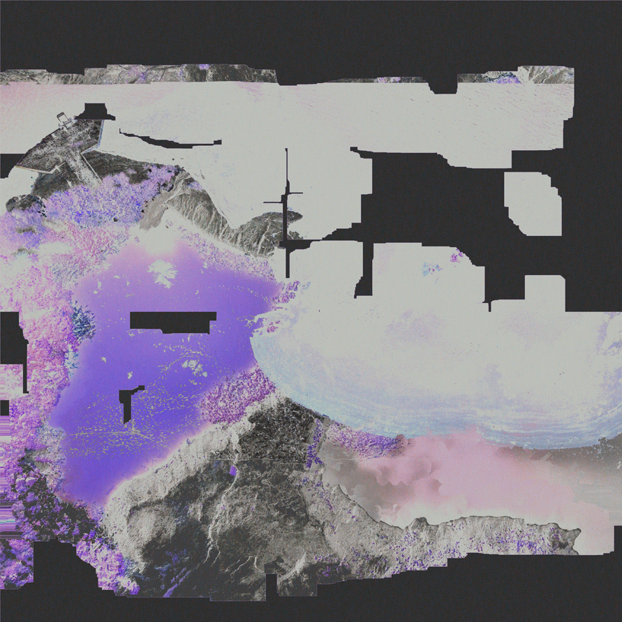
What did you research when developing ideas for artwork?Geometric Love: Since the typeface and color palette were already decided, I focused on form and texture. I scoured for broken images of nature—rocks, wood, leaves—and tried to find shots that had lost their sense of scale or didn’t make sense upon closer inspection.
Please share an insight into the design development.
Geometric Love: I tend to experiment a lot during the initial design phase. The process involves creating a lot of imagery, then editing and blending it down into a final idea. I explored a lot of natural textures and abstract imagery, constantly reworking them to build layers and depth. Nothing really goes wrong when designing this type of sleeve; sometimes the accidents lead to the best solutions. Sergio, the label manager, has a very keen sense of what he wants, and he usually lands on a sleeve choice pretty quickly. Of the half-dozen ideas I share with him, he’ll provide feedback and indicate his preferences, and I’ll refine those into the final design.How did you develop the design and how does the final artwork reflect the music?
Geometric Love: Whether the final artwork reflects the music is obviously quite subjective. Personally, I feel it lands exactly where I intended. The mysterious and atmospheric qualities of the artwork capture the essence of the sound, giving a visual representation of the music’s dreamlike, disorienting mood.Design by Geometric Love
Buy the ‘Threnode EP’ vinyl here
© Transmission Publishing (2025)