Oh Mr James
I'm Not Here
Design by Geometric Love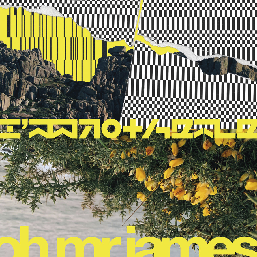
Geometric Love is a Brighton, UK, based graphic design, image making and motion studio founded by Steve Hyland. The studio create unmistakably contemporary work for clients in the culture, entertainment and music industries, as well as for museums, schools and the private sector. We spoke to Steve about taking inspiration from the Cornish, UK, natural environment, the rave heritage of its braindance scene and late 1990s electronic graphics, to create custom typography and sleeve design for the I'm Not Here by Oh Mr James.
Released by Analogical Force (2025)
Hello. Please tell us about the brief and commission. Steve: Analogical Force (Spain) commissioned me to create the sleeve design for I'm Not Here by Oh Mr James, a music project that had Cornwall (region in Southern UK) and the rave heritage of its braindance scene at its core. The EP is a riotous voyage through acid and braindance, nodding to the past while offering a fresh take on that lineage.
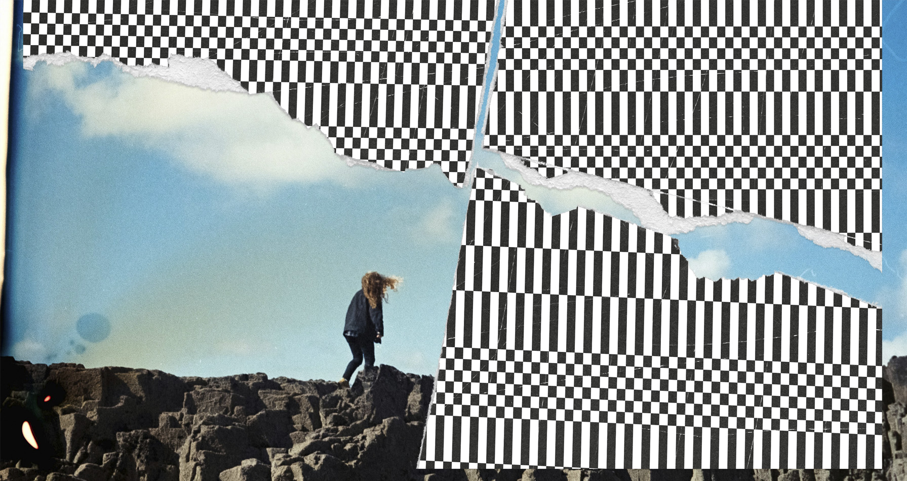
Visually, I aimed to fuse natural imagery with graphic, almost coded elements - something that feels both organic and synthetic. The natural environment of Cornwall and the sense of algorithmic disruption became anchors for the direction.
How did the music inspire the creative process?
Steve: It’s a fantastic record, full of dynamic production and playful incongruity that mirrors how we navigate versions of ourselves online. The tracks act like shapeshifters: you think you’ve cracked their logic, and then they fold into a new pattern, keeping you alert. That tension informed a lot of my design decisions.
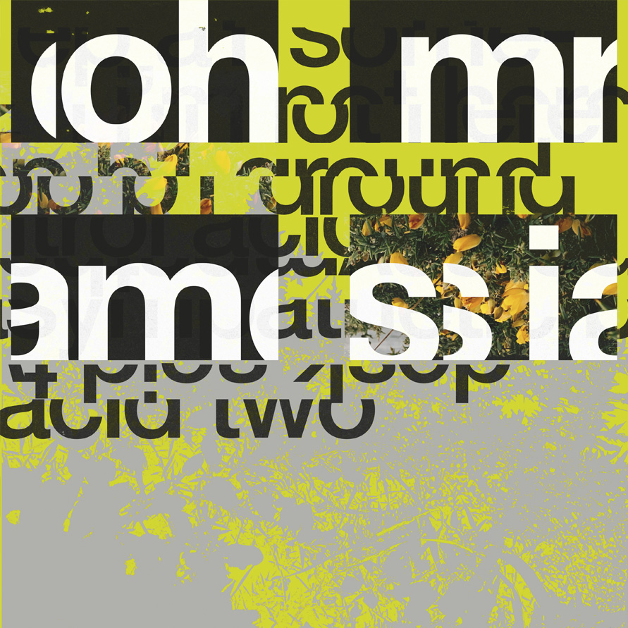
I wanted to create visuals that felt as if they were in constant motion, even on a static sleeve. This led to a fusion of natural imagery and post-digital graphics, with an emphasis on rhythm, repetition, and fragmentation - mirroring the music’s structural approach. The organic photos speak to the melodic, human qualities, while the geometric patterns and fragmented typography echo its mechanical precision. The colour palette - anchored by a saturated industrial yellow - was established early as a defining conceptual and strategic element.
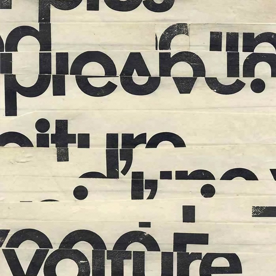
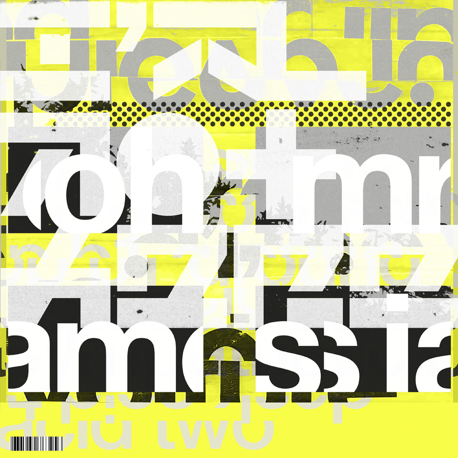
What did you research when developing ideas for artwork?Steve: Research began with the semiotics of electronic-music design, both typographic and visual. I knew I wanted a bespoke typeface that felt like a coded artefact, offset by more legible language and iconography reminiscent of late-90s graphics: big type, loud colour, unapologetically overstimulating. The challenge was capturing that energy without slipping into pastiche.
To counterbalance it, I went in the other direction: studying landscapes, natural textures, and botanical photography for a sense of grounding. The record contains pockets of calm within its more kinetic moments, so nature became essential - not romanticised, but functioning as a counterweight to the chaos.
Please share an insight into the design development.
Steve: When I’m designing for music, my workflow becomes polycentric - ideas emerging from different directions like overlapping rhythms, each influencing the next. Bespoke typography is usually a cornerstone of my sleeves. The type here draws from late-90s electronic graphics that, to me, still feel timeless - always looking slightly futuristic. I then abstracted the typography until it felt subtly dystopian. The artist name, set in lowercase, overly condensed and cut off, comes from the same instinct I had 25-odd years ago designing electronic music sleeves: trying to be quirky and original, yet somehow future-retro.Next, I placed the photographic elements - something steady to anchor the chaos. Then I introduced structured layers: grids, patterns, and coded symbols that interact with the image rather than simply sitting on top. Once the system’s “rules” were established, I began breaking them: stretching patterns beyond their grid, letting textures bleed into type, tearing the page, stacking elements until the noise level felt right. I tend to overload my designs - I’m a visual magpie - but then I step back, create space, reduce density, and restore clarity without losing the energy.
Design by Geometric Love
Buy Oh Mr James 'I'm Not Here' EP vinyl here
© Transmission Publishing (2025)