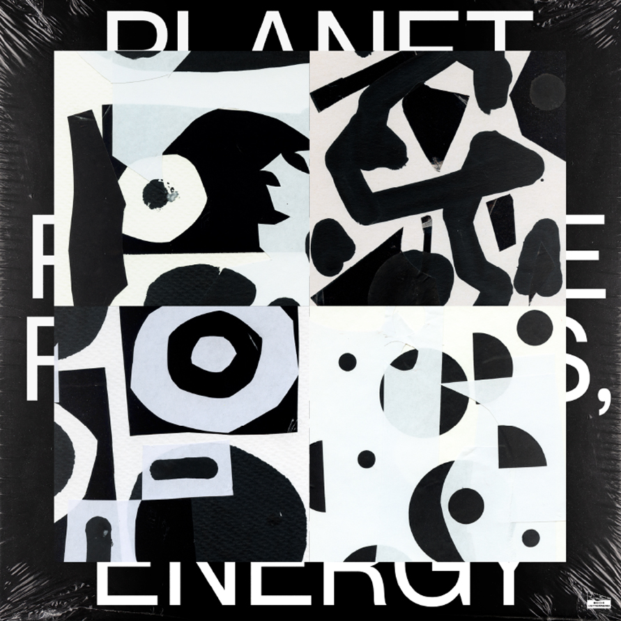
Planet Opal
Recreate Patterns, Release Energy
Design by Jacek Rudzki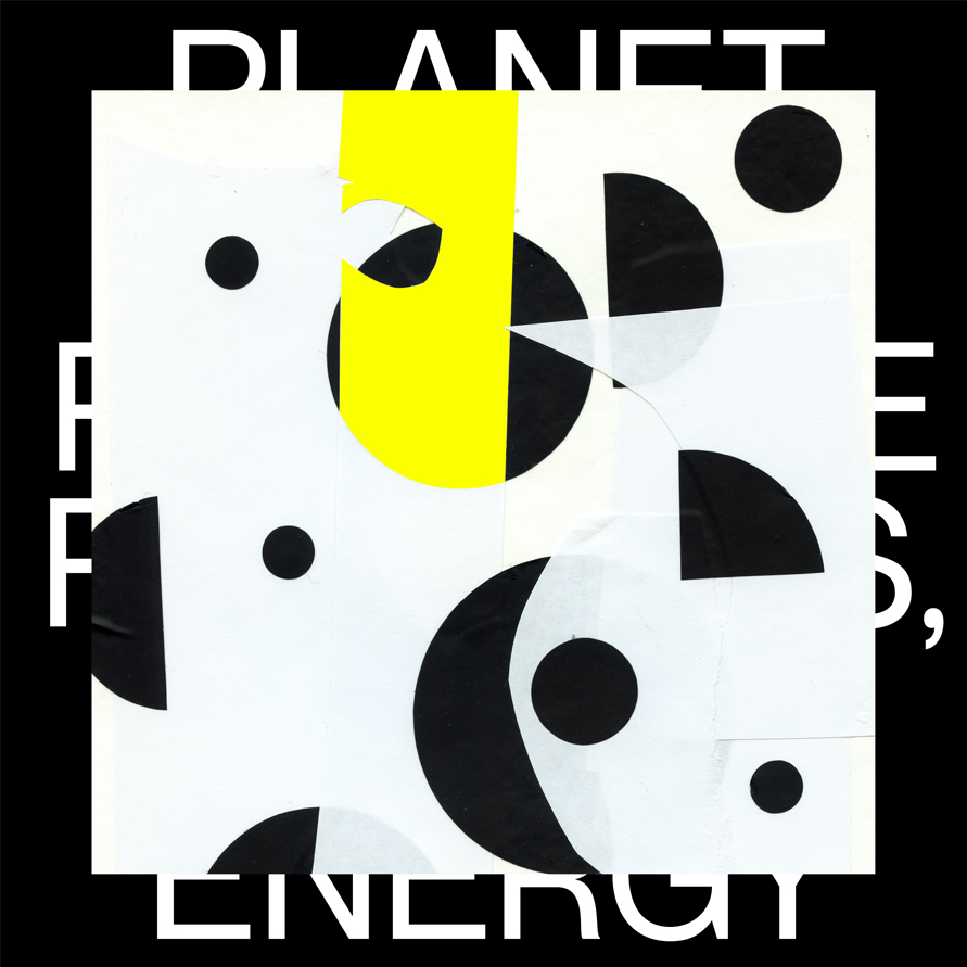
Jacek Rudzki is a graphic designer and illustrator from Krakow, Poland. He works under the studio alias Znajomy Grafik (Fellow Graphic Design) creating simple and memorable visual communication, art direction, graphic design, print and illustration for clients in the music, culture, and entertainment industries. We spoke to Jacek about adapting his ‘Papiernik’ personal project into the sleeve design for ‘Recreate Patterns, Release Energy' the forthcoming album by the Italian electronic music duo Planet Opal.
Released on Dischi Sotterranei (2025)
Hello. Please tell us about the brief and commission. Jacek Rudzki: I wasn’t familiar with Planet Opal before. The co-owner of the club Ślina (Poznań, Poland), for whom I had previously designed event posters, recommended them to me. Planet Opal came to play at Ślina and that’s how they found me.
Our collaboration started when Giorgio Assi (Planet Opal producer, synths, vocals) complimented my Papiernik project, a series of abstract form explorations, using adhesive paper, that's inspired by the use of coloured paper in my 5 year old daughters drawings. I shared a catalog of the works with Giorgio and Leonardo De Franceschi (Planet Opal drums and percussion) so they could choose what they liked. They let me know which designs resonated with them and fit the music theme, and I started working on the project. The LP layout includes pieces from the Papiernik series, which were modified to fit the final design.
How did the music inspire the creative process?
Jacek Rudzki: I listened to fragments of the album to get a feeling of the music. What stands out to me in Planet Opal’s music is the contrast between human and digital elements. Papiernik also explores contrasts – whether in form or colour.
Ideas emerged through conversations with Giorgio and the exchange of visual references and experiments, including a series of playful compostions using my daughters felt, which I originally posted on Instagram @znajomygrafik. He was initially drawn to these colourful compositions but was struck by the impact, energy and contrast between the bright yellow and grey/black elements and liked how they balance chaos and order while maintaining clarity and cleanliness—elements that resonate with the original concept behind the Planet Opal music project.
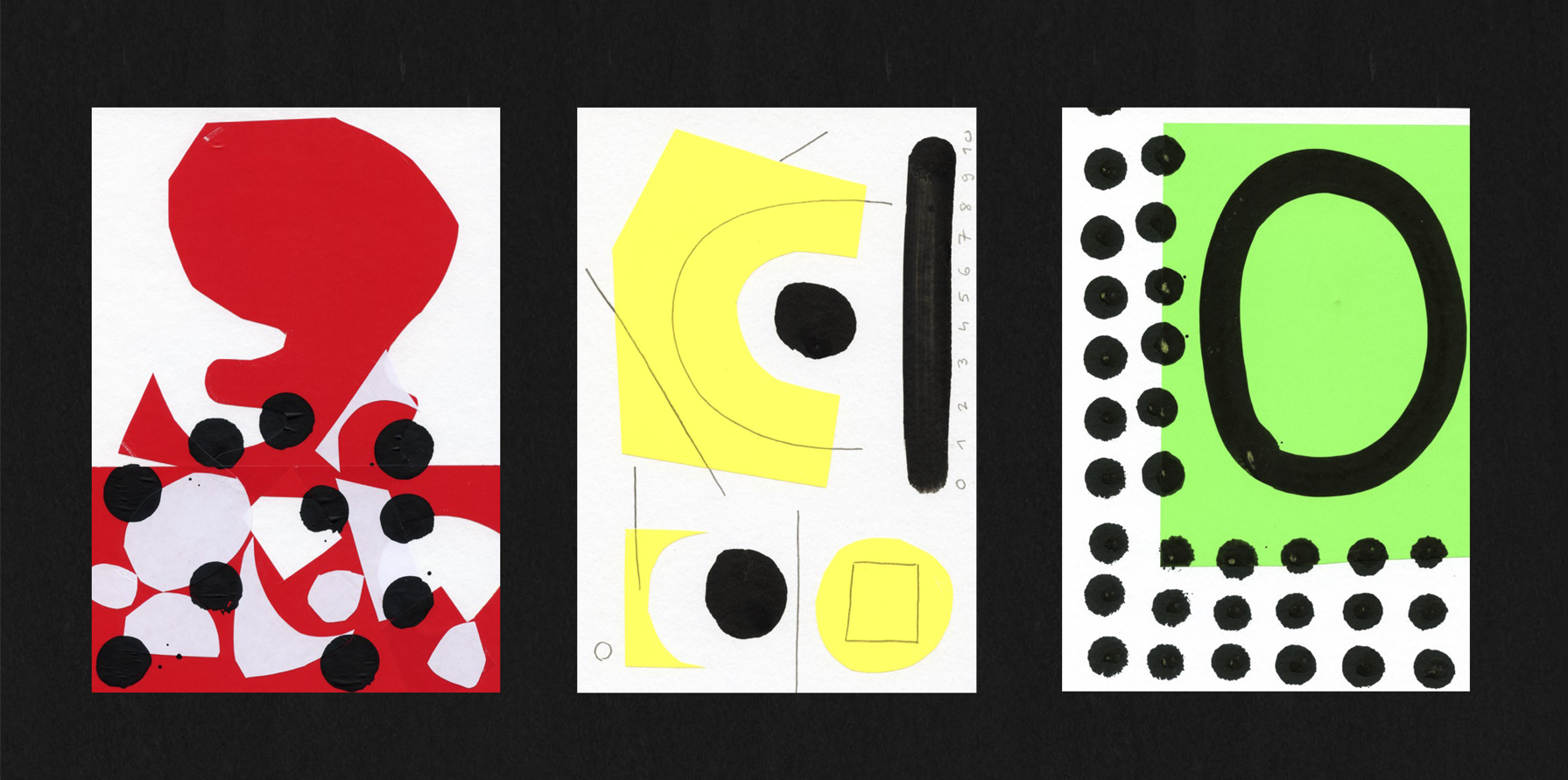

What did you research when developing ideas for artwork?Jacek Rudzki: Since the design is based on my own graphic explorations, I’d say the sources of inspiration are twofold. When creating Papiernik works, I draw inspiration from my 5-year-old daughter’s creativity and her free artistic expression. I also focus heavily on colour and form.
As for the album layout, I’ve always been drawn to modernist design principles. That’s why I chose the Pangram Pangram Neue Montreal typeface and a limited colour palette.
Please share an insight into the design development.
Jacek Rudzki: You could say this was a dream project. Giorgio and Leonardo were interested in my work and wanted to incorporate it into their release. I prepared several variations, and I think every one of those is working. I’m satisfied with the outcome and that I got to use something I created as a self-initiated project in a commercial project.The collaboration worked so well that Planet Opal expanded the commission to include concert merchandise and T-shirts, which is always fun to do. As for the physical release, we’ll see, but I’ll try to convince the label to go for a coloured vinyl edition and add premium finishes like spot varnish or embossing on the cover.
Design by Jacek Rudzki
Typeface Neue Montreal
Buy the Recreate Patterns, Release Energy vinyl here
© Transmission Publishing (2025)