Merzbow
Sedonis
Design by Joe Gilmore
Joe Gilmore is a British graphic designer working with global artists and cultural organisations to create books, exhibition catalogues, music packaging, identities and websites. We spoke to Joe about the artwork for Sedonis, the first physical release by Signal Noise, a new platform for experimental music, noise, and video art, based in Chicago, and developing the design system for subsequent releases.
Released on Signal Noise (2025)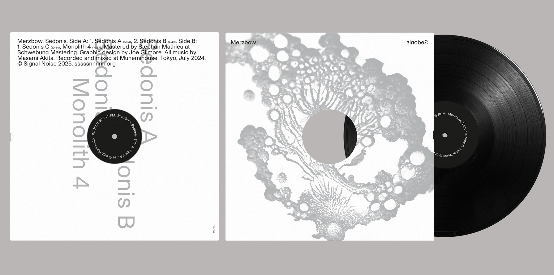
Hello. Please tell us about the brief and commission. Joe: The Sedonis project emerged from a broader commission to develop the graphic identity for Signal Noise, a new record label based in Chicago. The label’s co-founder, Kikù Hibino, discovered my work through a series of covers I designed for the Italian label Superpang. He approached me to design a similarly unified design system for Signal Noise.
Sedonis is the label’s first physical release (there were three digital releases prior to this). The project was mediated through the label, rather than working directly with Masami Akita (Merzbow). I had creative freedom regarding printing, materials and finishing. The label wanted to avoid producing a standard LP sleeve, the idea being to make a more premium product using more specialist papers and print techniques.
My design concept centres on the use of a single image on the front cover, rendered in black, metallic silver, or full colour. For Sedonis, we incorporated a small scale die-cut hole in the sleeve, referencing the 12” disco single format.
I also developed the inner sleeve design (pictured below) that will be used across future releases. This is fairly minimal, consisting of the logo and the words ‘signal and ‘noise’ on each side. The overall design concept is designed to be quite flexible, so the typography will playfully evolve with each subsequent release.
How did the music inspire the creative process?
Joe: I'm familiar with Merzbow’s music. The label shared some pre-mastered tracks and I listened to these before I started the design. There are string instruments in some of the tracks, alongside abstract electronic sounds.
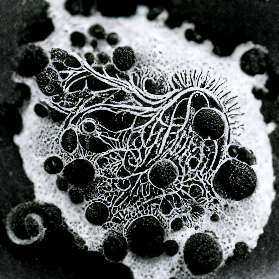
I instinctively knew what kind of image I wanted to use for the cover. The image is one of a series of images I created using Midjourney. I'm interested in the uncanny – the liminal space between recognition and ambiguity. The text prompt used to generate these photographs consisted of descriptions of things which do not exist, often using terminology drawn from a range of disciplines such as biology, geology, chemistry and mathematics.


What did you research when developing ideas for artwork?Joe: Kikù and I shared the design with Masami and he liked it. We made a wet proof with Rohner Press in Chicago, who printed the silver image onto the cover stock. The printer put a lot of effort into producing dummy covers with the inner sleeve and vinyl, to make sure that everything fitted together snugly.
Please share an insight into the design development.
Joe: The cover is printed using a metallic silver Pantone with black on an uncoated heavyweight eggshell board. It has the aforementioned disco sleeve hole, plus a die-cut thumb notch on the right edge. The text on the back is de-bossed to look like letterpress. The inner sleeve is printed black onto a gloss coated stock. We really liked this tactile contrast, as the soft textured outer sleeve plays against the shiny inner.The Sedonis title is reversed on the front cover, in reference to earlier design tests. We initially wanted to use a transparent plastic sleeve for the covers with screen printed text in black and white ink on the front and back (pictured above), which meant the text is visible forwards and reversed. This proved too expensive, but we liked the aesthetic and decided to keep working with this idea.
Design by Joe Gilmore
Printing by Rohner Press
Buy the Merzbow 'Sedonis ' vinyl here
© Transmission Publishing (2025)