Chick Corea
Trilogy Deluxe Box Set
Design by Macroscopic
Macroscopic is a creative consultancy working in the intersection between art, science, and technology. The design studio was co-founded by Lawrence Azerrad, Amy McGovern and Patrick McGovern, based in the US, working with premier organisations across private, public and social sectors including Warner Music Group, AlleyCorp and MIT Space Exploration Initiative. Lawrence is the author of Supersonic: The Design and Lifestyle of Concorde (Prestel, 2018), and co-wrote his second book, Mirror Sound, A Look into the People and Processes Behind Self-Recorded Music (Prestel, 2020), with Spencer Tweedy. He has spoken on design and inspiration at The V&A Museum, London, at TEDxUCLA, The Smithsonian and at universities, professional organizations both nationwide and internationally. We spoke to Lawrence about the design direction for the Chick Corea 'Trilogy' deluxe edition box set which is released on vinyl for the first time.
Released on Concord Jazz (2024).
Hello. Please tell us about the brief and commission. Lawrence Azerrad: Macroscopic has worked on several projects for Concord Jazz, primarily designing album packages for the exceptional jazz multi-hyphenate, Esperanza Spalding. Through this, we’ve developed a close working relationship with the Concord Jazz team — people who genuinely care about the music and strive to release meaningful products for the listener community. Having that kind of shorthand and trust with them makes a huge difference in the outcome of a project. It allows for creative freedom and a willingness to push the work as far as possible to create something valuable — something the audience will (ideally) appreciate.
Chick Corea passed in 2021, and unfortunately, I never had the opportunity to work with him directly. However, he was a 27-time Grammy-winning jazz legend, and his influence in the jazz world is immense. I was well aware of the gravity of his music and the dedication of his fans. Additionally, I’ve designed ten album packages for the acclaimed jazz pianist Brad Mehldau (for a different label). His collaborators, Christian McBride and Brian Blade — who were part of the Chick Corea Trio — have also appeared on many Mehldau projects. So, while I hadn’t worked with Corea personally, I was very familiar with two-thirds of the trio. Through my years designing for jazz artists, it’s impossible not to appreciate what the Chick Corea Trilogy records mean to the jazz community. In a good way, it’s a close-knit world.
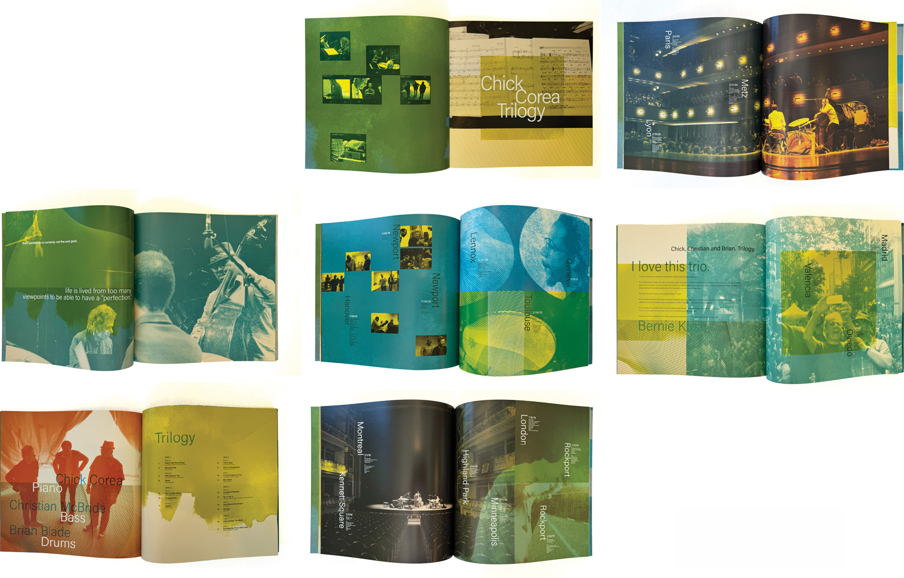
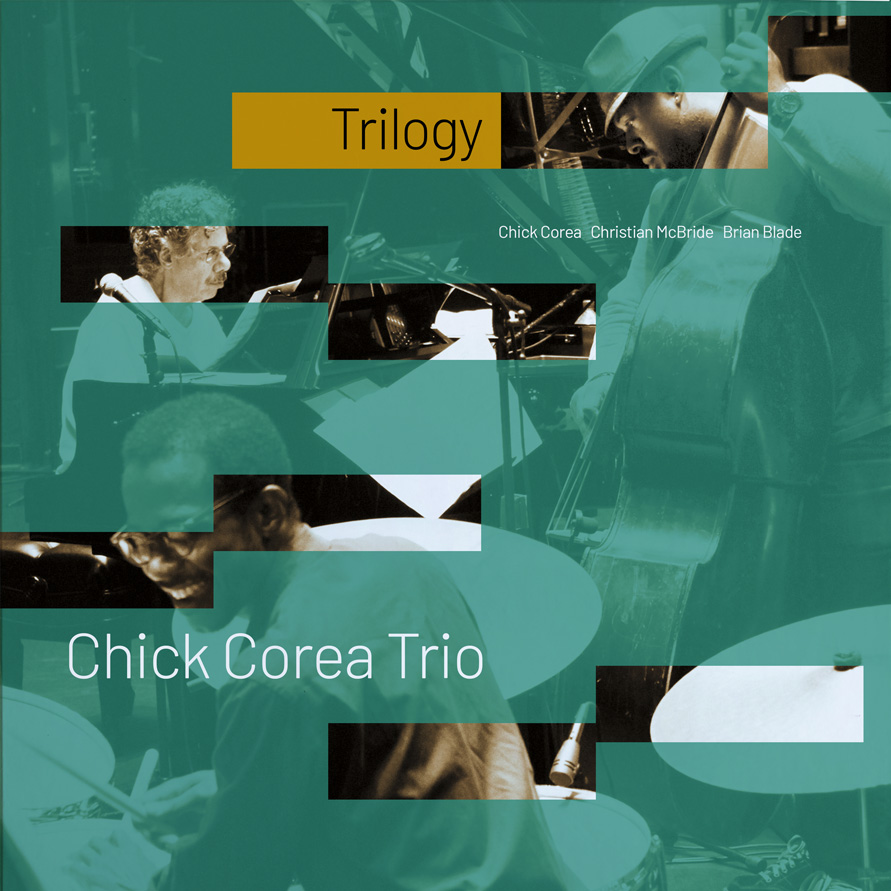
This boxed set marked the first time Trilogy One and Trilogy Two (originally released in 2013) were available on vinyl. The Trilogy series is beloved among Corea fans, as both albums document live performances from a world tour with Corea, Blade, and McBride. The original releases were highly successful on CD, and the goal for this project was to create a vinyl box set that would capture and honour the audience’s deep affection for these recordings. The challenge was to design something tangible and covetable—an object that fans would be excited to own and display in their homes.
How did the music inspire the ideation process?
Lawrence Azerrad: The trio’s joy in these live performances is unmistakable. You can hear their fluidity, their playfulness — it’s clear they were having fun on tour. This was confirmed when I received the photo archive from the concerts. Both onstage and backstage, it was evident that these three musicians were not just collaborators, but artists deeply enjoying the journey together.
Since the fan community was already familiar with the CD releases (which are now widely streamed), the album cover image had an established precedent. I didn’t design the original 2013 packaging, so it felt logical to retain the same photography — changing it would have risked confusing the audience. The real challenge was: how do we use the same image but bring a fresh perspective to it? The goal was to amplify it in a way that felt reverent — staying true to the known body of work while using design to signal that this is a special edition of an album the community already loves.

What did you research when developing ideas for artwork?Lawrence Azerrad: When I was in art school, my first real design obsession was the Blue Note album covers by Reid Miles. I know they’re often referenced—and at this point, widely imitated— but when I first discovered them in the 1990s, they felt incredibly fresh to me. At the time, digital design and deconstructed design was taking off with publications like Ray Gun and Emigre Magazine, yet these covers from an earlier era felt pure, straightforward, and still full of rhythm, tension, and cool elegance.
That early impression never left me. In a lot of my work — both for music and beyond — I hear people describe it as “classic.” That sensibility is ingrained in me, like the air I breathe. But the real challenge is: how do I honour that visual language while evolving it? How do I take something inherently classic and stir it in a way that best fits what the music is truly about?
Please share an insight into the design development.
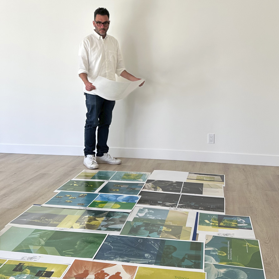
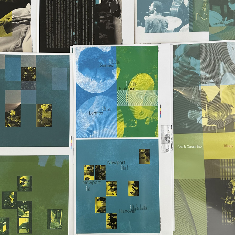
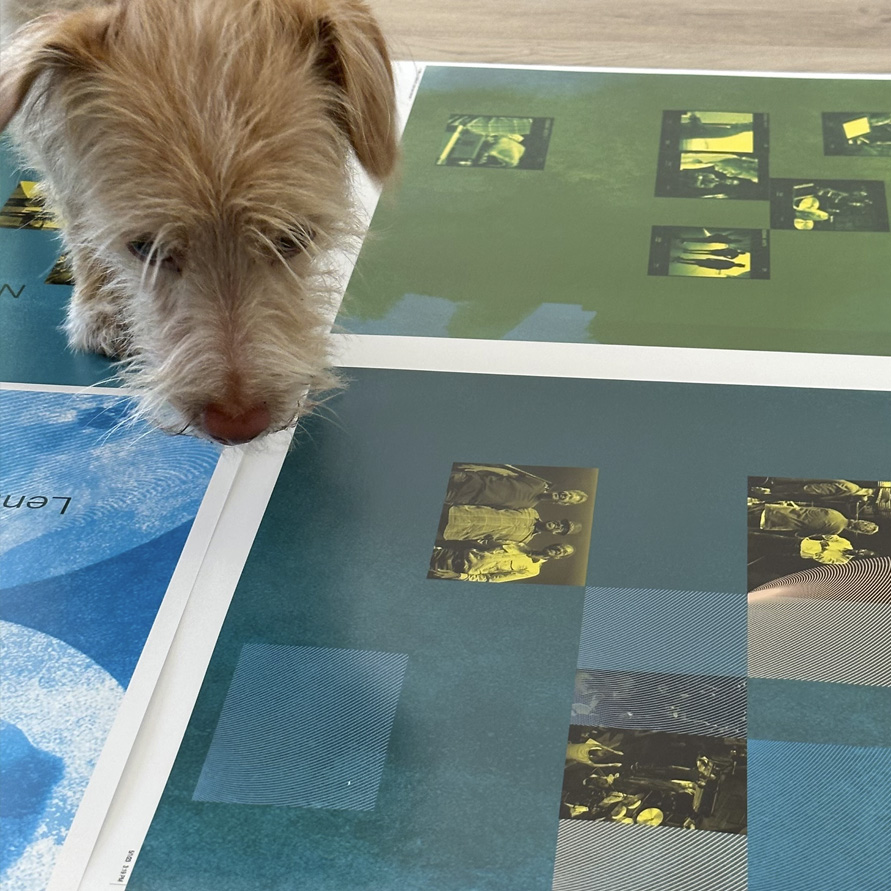
Lawrence Azerrad: One of my favourite aspects of the package — something that’s hard to fully appreciate in photographs — is the outer box itself. As a constructed object, it’s substantial. The box walls are exceptionally thick, with an inner neck that fits seamlessly into the opposite piece. The corners are sharp-edged, which makes a significant difference given the box’s substantial build. Unlike traditional bent board, this is a constructed piece — it feels almost like a piece of furniture.A key design detail is the horizontal split, which is intentionally off-centre. This irregular seam adds a distinctive, unexpected element that we were thrilled to get through. Another highlight is the use of different paper stocks on each half of the box. One side features an unfinished kraft paper, reflecting the improvisational and organic nature of the music, while the other has a cooler, more refined finish. Both halves are unified by fluorescent varnished lines woven throughout the artwork—extending across the entire package — printed in fluorescent Pantone ink.
We collaborated with Spark Manufacturing, based in Burbank, California. Nearly every special-edition box set that wins a Grammy is produced by Spark — they don’t just execute ideas, they guide you through incredible possibilities. It’s a true collaboration where their expertise and capacity open up new creative opportunities. More than just skilled manufacturers, they’re also genuinely great people to work with.
I had recently completed another boxed set where the manufacturing experience was the exact opposite of this one, so working with Spark felt like a breath of fresh air. It was a partnership built on possibility and the realisation of that possibility.
How did you develop the design and how does the final artwork reflect the music?
Lawrence Azerrad: There was significant creative freedom. Chick’s manager, who represented his estate and legacy, was involved in the review process. Working on a posthumous project is always a delicate balance — you want to honour the artist’s memory while presenting it through a contemporary lens. The goal was to reflect that Corea’s music continues to live on, transcending the era in which it was recorded. A piece from the 2010s doesn’t need to feel locked into that time frame, just as something from the 1960s can be reimagined beyond its original context.Throughout the design, I incorporated a range of watercolour washes to visually echo the fluidity and improvisational spirit of the music. The colour treatment of the images introduced a fresh, almost “new season design” unique to this release, distinguishing it from previous versions while giving it a signature identity. We leaned heavily into the visual language of overprinting — a nod to both the beauty of traditional printmaking techniques and the unexpected, happy accidents that define jazz itself.
Design by Macroscopic
Buy the Chick Corea Trilogy Deluxe Box Set here
© Transmission Publishing (2025)