Russell Haswell
Deep Time
Design by MuirMcNeil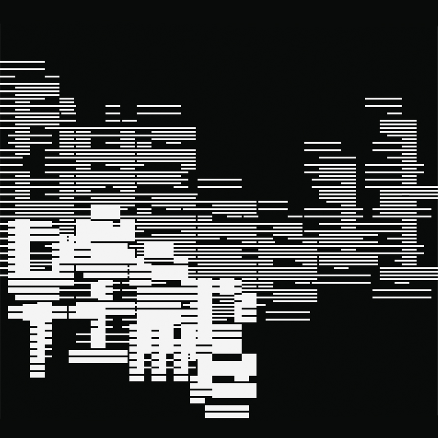
MuirMcNeil is a type, motion and graphic design studio founded in 2009 by Paul McNeil (typographic designer, educator and author) and Hamish Muir (graphic designer, educator and co-founder of 8vo design studio and Octavo, Journal of Typography). The studio output focusses on exploring systematic and algorithmic methods in type design, graphic design and moving image. We spoke to MuirMcNeil about their typographic cover design for 'Deep Time' by the English multidisciplinary artist Russell Haswell.
Released on Diagonal Records (2025)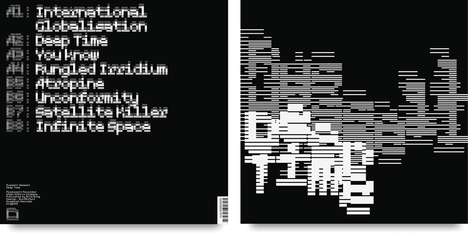
Hello. Please tell us about the brief and commission. MuirMcNeil: We’ve known Russell Haswell since 2015. He originally commissioned MuirMcNeil to design a poster to promote a three day mini-festival he curated at Café Oto, London, a creative space for new music. He then commissioned us to design the album sleeve for ‘Reality Therapy’ which was released by Diagonal Records, UK, in 2023.
Russell's brief was "DEEP TIME is a mid-late 80s inspired album in terms of its mood ... it's generally a reflection on the fact that everything we worried about in the 80s is happening now. Themes are: sci-fi prediction becoming real, geology, electronic and space warfare, psychedelics, chaos theory, random generation"
How did the music inspire the ideation process?
MuirMcNeil: In a Zoom call to discuss the brief, Russell mentioned he'd been walking in the Scottish countryside and had become fascinated by exposed rock strata, which became the visual reference point alongside layering.
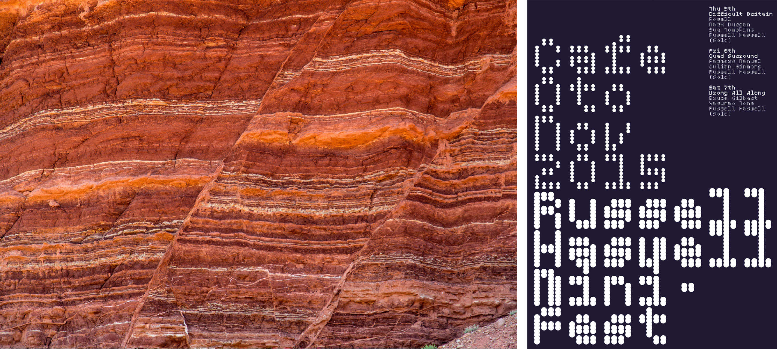
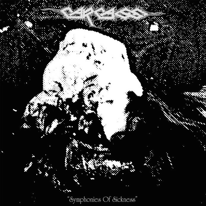

What did you research when developing ideas for artwork?MuirMcNeil: We didn't conduct any research during the process aside from listening to the music. We were supplied an initial reference image of the Carcass album 'Symphonies of Sickness' released by Earache Records in 1989, and we licensed images of exposed rock strata from a photo library.
Please share an insight into the design development.
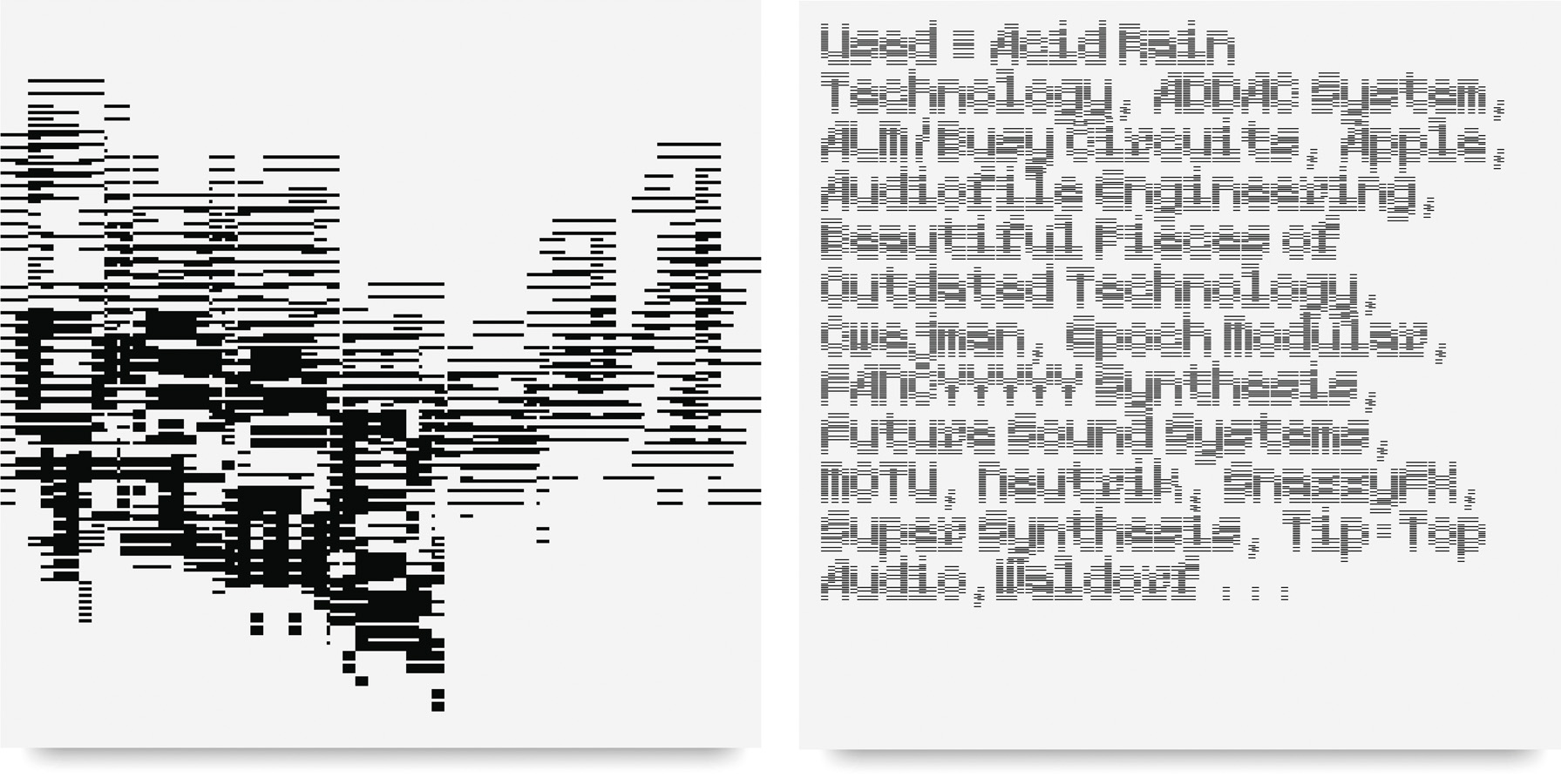
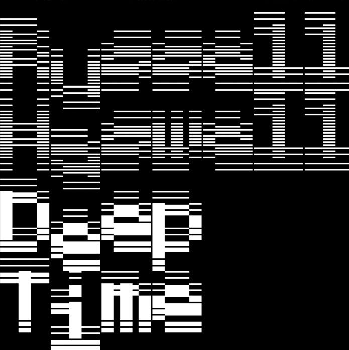
MuirMcNeil: The rock strata imagery proved to be a false start – too obvious, and as it turns out, the images we found were non-specific and nothing like the unique strata at Siccar Point in Berwickshire on the east coast of Scotland, which Haswell had visited when working on Deep Time. The typographic direction we adopted for 'Deep Time' is a continuation from our first collaboration, the typographic poster design for the Café Oto residency, and the ‘Reality Therapy’ sleeve. For Deep Time we used ‘TwoStroke’, a typeface from the extensive Two Type System (designed by MuirMcNeil). In common with most of MuirMcNeil’s typographic projects, the design evolved through a process of iterative prototyping.How did you develop the design and how does the final artwork reflect the music?
MuirMcNeil: Hopefully the sleeve design challenges reading, as the sound challenges listening.Design by MuirMcNeil
Typeface TwoStroke
Buy the ‘Deep Time’ vinyl here
© Transmission Publishing (2026)