Susumu Yokota
Skintone Edition Vol. 1
Design by Non–Format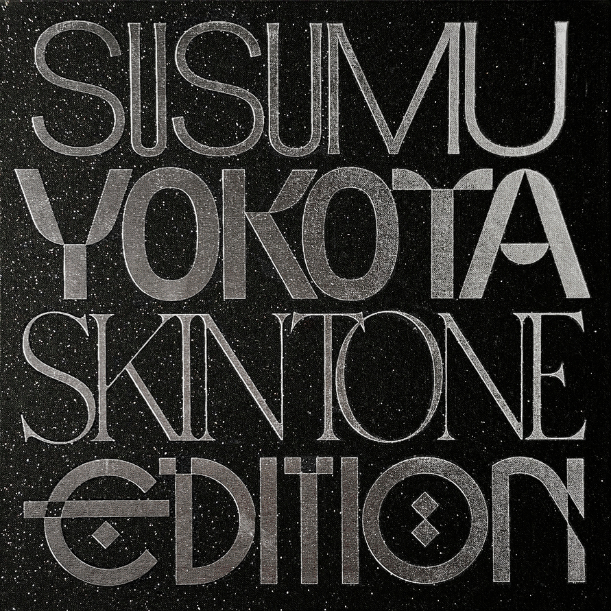
Non–Format is the creative partnership of Kjell Ekhorn (Norway) and Jon Forss (UK). The studio is renowned for its expressive imagery and custom typography, created for multi-national brands, publishers, retailers, record labels, and cultural organisations. We spoke to Jon Forss about the design direction for Susumu Yokota: Skintone Edition Vol. 1, a very special reissue boxset released to mark the tenth anniversary of the musician's death.
Released by Lo Recordings (2025)
Hello. Please tell us about the brief and commission. Jon: Lo wanted to make a big statement about the importance of Yokota’s work. They wanted something that would suitably honour his legacy, so a two-volume box set that pulls together all the releases on his own Skintone label seemed like a wonderful way to achieve this. We had to find a way to draw all of these disparate record sleeves together under one cohesive visual umbrella. There was an added level of pressure because Yokota was a graphic designer before he was a musician, so many of the Skintone albums were designed by Yokota himself. We knew we would have to tread a delicate path between honouring Yokota's original artworks while creating a completely new aesthetic to tie them all together.
Our working relationship with Lo Recordings goes back almost to its founding in 1995 when label founder Jon Tye invited me to design the packaging for his Twisted Science album Blown back in 1996. This was four years before I started working with Kjell Ekhorn, and another year or so before we established Non-Format. We’ve been designing packaging and all kinds of design work for Lo for very nearly three decades, so I think they trusted us to deliver a design worthy of Yokota’s legacy and we knew they would make every effort to produce the packaging to the highest standards.
How did the music inspire the creative process?
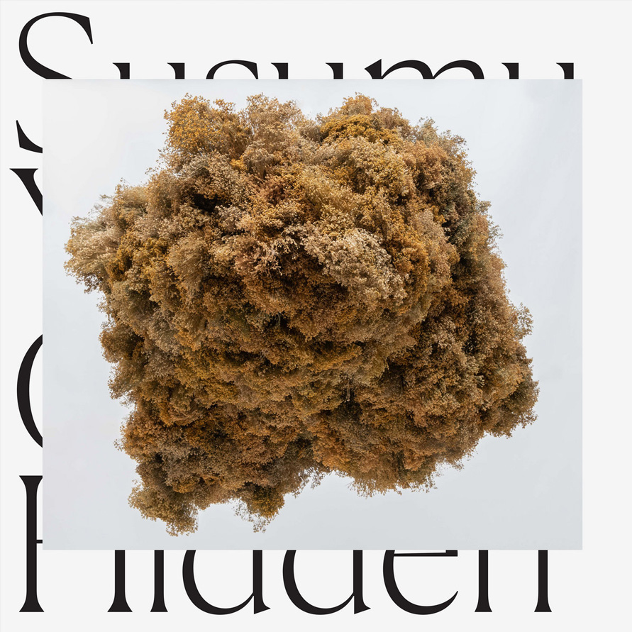
Jon: The past album covers are quite disparate in terms of design, although most are purely image-driven, rather than typographic, which gave us our first clue as to how to establish a framework for the rereleases. In 2019 we designed the sleeve for Yokota’s album Cloud Hidden (pictured below), which had his name and the title in the same serif font, filling the front cover. On top of this we placed a large photo of a sculpture by Emma Weaver, which obscured most of the typography.
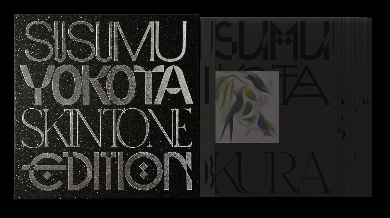
We thought that this approach might work well for all of the rereleases too. So, we created several sets of new typefaces (nine in total) to reflect the diverse nature of Yokota’s work, and then selected one typeface for each line of the name and title of each album. Most of the albums have two disks, so there are 13 disks in each box set. The result, across both volumes, is 26 inner bags, each with a mixture of these new typefaces filling the front of the sleeves. These titles are printed in black onto a Pantone green/black, to create a subtle, dark background for Yokota’s original square album artworks, which are all printed at the same size, obscuring parts of the titles. The overall effect is, we hope, a kind of disparate unity.


What did you research when developing ideas for artwork?Jon: A few of the typefaces are pretty straightforward serifs or sans serifs with obvious European roots but many are quite expressive or experimental in form, with nods towards Japanese typographic or architectural forms. We wanted each typeface to have its own distinct expression, knowing that once they were mixed together across so many surfaces they would create one harmonious visual expression.
We thought it would be good to be quite flexible with all these typefaces so that the three U’s in Susumu wouldn’t have to all be the same. We thought it was important not to be too rigid or formulaic, given the expressive, experimental nature of Yokota’s music.
For example, the E in EDITION has a kind of medieval quality. We wanted the typefaces to appear to span centuries rather than be tied, aesthetically, to just a few decades. Yokota sampled and wove together music from an incredible range of eras, so it seemed fitting to approach the typography in a similar way. The typeface we made for EDITION was inspired by a video we saw about someone dismantling an old Japanese house, beam by beam, joint by joint. There were no nails, no screws, just hand sawn wood and pegs. Craftsmanship at its finest.
Please share an insight into the design development.
Jon: Each of the albums features the original cover art but we gently abstracted each image slightly so that they are no longer just crisp reproductions but more like a vague memory of the originals. When seen from afar they appear very much like the originals but when you get closer they seem less clear. This is just another layer of the design that ties everything together while hinting at how perception can change over time.As mentioned before, we used a special Pantone ink for the backgrounds of each sleeve. This was to ensure colour consistency across so many different sleeves. Choosing this colour was one of the hardest parts of the job. We did a test run with a different colour but it wasn’t nearly dark enough. We wanted the type to be very subtle against the background, allowing the square artworks to be the focus of each sleeve. We added a spot UV varnish to each square image too, which helps create contrast in texture as well as colour.
If you buy the albums individually (they are being released one by one over the course of a year) the inner bags come in an outer sleeve which has a square hole cut in the middle, allowing the main image to be on display. There is also a bellyband for these versions which holds everything together.
The original idea for the box set slipcase was to print in silver foil onto plain grey board but this turned out to be extremely difficult to achieve, so we decided to wrap it in this black linen paper with flecks of silver foil embedded in it. It felt to us like staring up into space. We tried black foil for the large text but it completely disappeared. The silver foil looks much better.
The Skintone Edition box sets are released in two volumes. The first volume contains the first 7 albums and a follow up (Vol. 2) is scheduled for release in 2026. Each album is also available to buy individually and released over the course of 2025–2026. For example, the first album (Magic Thread) was released on 1 August. The second album (Image 1983–1998) is released on 29 August.
Design by Non–Format
Buy the Susumu Yokota 'Skintone Edition Vol. 1' boxset here
© Transmission Publishing (2026)