Red Snapper
Barb&Feather
Artwork by Paul Flack
Paul Flack is a British graphic designer and artist working with clients in the music, arts, fashion, and publishing industries. We spoke to Paul about his paired-back, geometric artwork for Barb&Feather, by Red Snapper, the iconic instrumental band, and how it translates visually across album formats and live visuals.
Released by Lo Recordings (2025)

Hello. Please tell us about the brief and commission. Paul: I received a call from Gavin at Lo Recordings, who expained that Red Snapper wanted me to produce the artwork for Barb&Feather. The band were keen to return to a strong, simple, graphic approach, and were still fans of the live visuals I created to accompany the Hyena album tour of 2014.
It was high praise to be invited to work with the band again, especially as a fan. I was also excited because this release coincided with Warp Records' 30th anniversary reissue of their debut album Reeled and Skinned (1995).
After speaking online, we agreed that the sleeve artwork for Barb&Feather (2 digital EPs and a vinyl LP) should also translate into visuals for their live performances.
How did the music inspire the creative process?
Paul: The Barb&Feather title plays off the title of their debut album, Reeled&Skinned, so there was a ‘fishy’ theme. However, I didn’t want to go down that route and I’m not sure the band did either. Instead, the title immediately made me think of 'opposites,’ which I started to explore visually through the contrast of lines and curves. The visuals were always going to be very clean, but I also wanted to convey a sense of movement, which came through the use of curved lines.
At this point I felt the image was strong enough to stand alone on the front cover and that no text was needed. However, the band were adamant that the Barb&Feather title should appear. My approach was to integrate text and the graphical content, with as little disturbance as possible. One idea Gavin and I developed was to remove all punctuation from the title, which made a noticeable difference.
For the back cover, I wanted to make a connection between the barcode and the main artwork. I turned the barcode horizontally and extended the curved lines so they flowed into one another. I’m not one to add humour in my artworks, but in this case, I thought the theme was so strong.
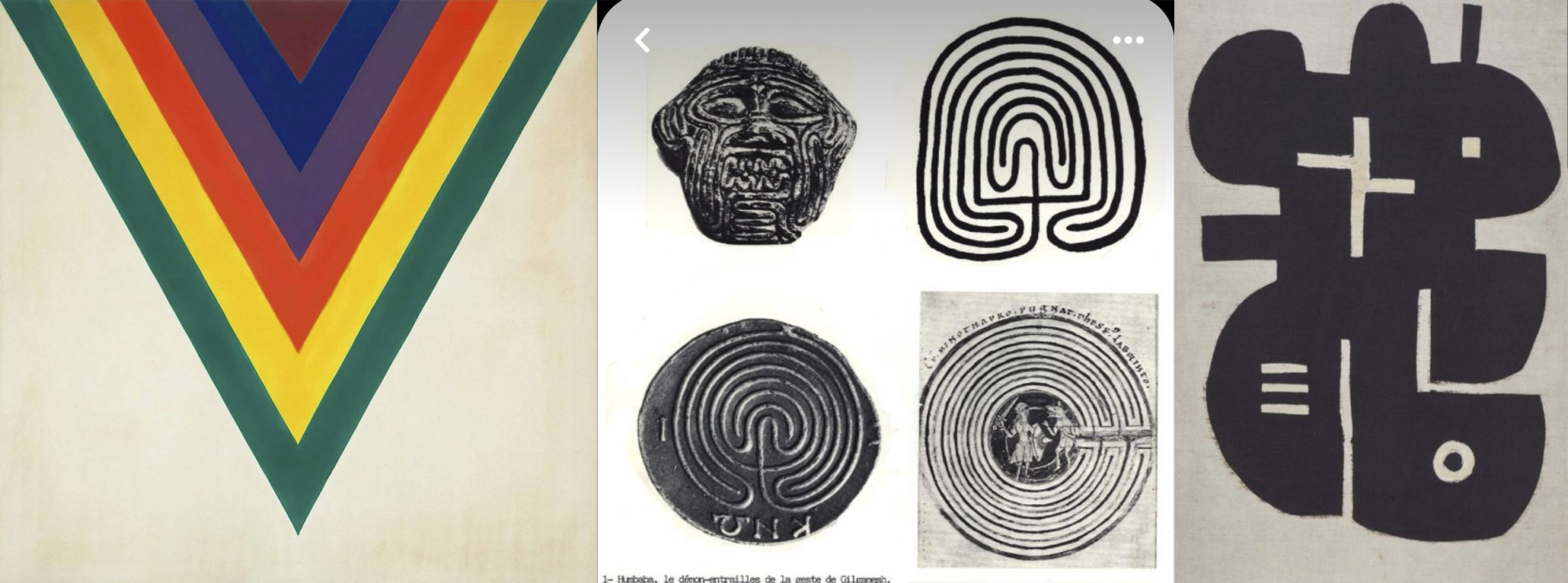
What did you research when developing ideas for artwork?Paul: I always start a new project by sifting through my many, many books. On this occasion, architectural, interior design, and vintage arts and crafts were on the menu.
I also have an extensive image library where I archive everything I have created, whether simple lines, curves, shapes, and photos, and years of unused projects. It's always a good place to start, especially for a project like this. I dug out some old visuals that I created for a club event, which immediately pricked my ears.
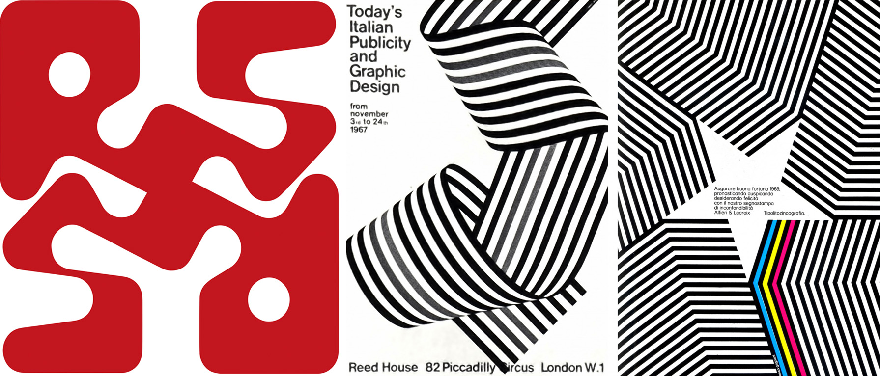
The final cover is a twisted version of these old club visuals, but greatly simplified, and heavily influenced by 1960s Italian graphic design. For some reason, I kept thinking ‘Olivetti’ and I approached this work in a similar way I would a collage. Like digital fuzzy felt!
The font was an interesting process. I wanted something fresh, but also with a tribal feel. We were all hesitant to use the 'Augure' typeface at first, as neither me or the band liked the Capital ‘R'. After about a million variations, we settled on a lower case ‘r’ and closed the gap between the band name, whilst retaining the capital ’S’ to form redSnapper. This made sense and the 'S' became a graphic feature.
The band also wanted an additional logo that could be combined with or without the ‘Augure Medium’ font and also feature across merchandise and future releases. This final logo (pictured above) was a 180 symmetry of the bands 'RS' initials, which was perfect for the vinyl labels. I felt that adding more geometric shapes would be overkill.
Please share an insight into the design development.
Paul: I don’t like just presenting one concept. I find that working on multiple ideas can trigger something unexpected, which can take you somewhere unplanned, and maybe develop an idea that can be revisited later. For this project. I prepared four different ideas, each with a full set of mock-ups. But I was always confident that the band would choose this design.The album combines two previously released digital EP's (one recorded live and one recorded in the studio) and I wanted the artwork for each to act as the inner sleeve, bringing the whole package together.
Artwork by Paul Flack
Typeface: Augure Medium
Secondary Typeface: Neue Haas Grotesk
Buy the Red Snapper ‘Barb&Feather’ vinyl here
© Transmission Publishing (2025)