Cristov
Defragmentierte Assoziationen
Design by Paul Loubet
Paul Loubet is a French artist and graphic designer (aka 1987 Graphics) whose multidisciplinary work explores how systems, especially video games, shape our understanding of power, history and conflict. We spoke to Paul about how he channelled his raw, low-tech aesthetic to create the cover artwork for Defragmentierte Assoziationen the experimental music release by Cristov (aka Christoph Lohse), inspired by themes of technology and dystopia.
Released by Abstrakce Records (2023)
Hello. Please tell us about the brief and commission. Paul: I’ve known the guys from Abstrakce for several years and have always been a fan of what they do, as well as BFE Records. So when they asked me to create the cover artwork for Defragmentierte Assoziationen it was YES. I didn't know Cristov before this project, and although we never met in person, we wrote to each other on the internet before and after the cover was completed.
The brief was really free. Joni from Abstrakce had previously bought some of my silkscreen prints (pictured below), which I made years ago, and asked if he could use one for a cover. But, I preferred to create a new design, one inspired by the original, instead of reusing an old one. I try not to repeat a project, even if I perpetually resample my own work.
How did the music inspire the creative process?
Paul: When I first listened to the album, I felt really happy to be involved in a project like this. It’s the kind of music I genuinely enjoy, so working on a cover for something that sounded this good was a real pleasure. I'm always happy to collaborate with people like Cristov and Abstrakce Records, especially when the music is that solid.
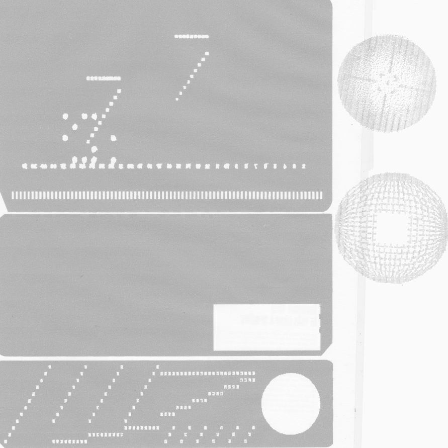
Cristov's sound is metallic, industrial, aggressive, and I felt that silver and red tones work well to reflect this. Same with the primitive electronic aesthetic, created using scans and forms from SD cards and old floppy disks (pictured below), which has a natural connection with the electronic music universe.


What did you research when developing ideas for artwork?Paul: The layout was built using scans and forms from SD cards and old floppy disks. Inside of it, you can see some little elements moving around the SD card maps, which were created on a text editor. I took screenshots of these elements and printed them on a matrix ticket printer to add some texture. What you see is a memory map, with little data evolving around it, that works well with the dystopian universe created by Cristov.
For several years now, I’ve been exploring the combination of black, silver, and bright colours in both my graphic design work and my paintings. I'm not sure if this interest comes from old Game Boy cartridges or from vandal graffiti... maybe a bit of both.
Please share an insight into the design development.
Paul: The cover was offset printed on a silver sticker, which was then applied to a black record sleeve. It worked out really nicely. Then Guillermo from Abstrakce (who also runs a letterpress and typography workshop) added typographic elements to a sticker, which was placed on the plastic wrap. No ideas were rejected. It was a one-shot. Cool.Design by Paul Loubet at 1987 Graphics
Buy art by Paul Loubet
Letterpress by Obsolete Letterpress
Buy the Cristov 'Defragmentierte Assoziationen' vinyl here
© Transmission Publishing (2026)