The Utopia Strong
Doperider
Design by John O’Carroll and Chris Reeder
John O’Carroll and Chris Reeder have run Rocket Recordings, UK, for over 28 years, after the label evolved from a serious musical interest into a full-time job. We spoke to John about his shared role as art director at Rocket and the influence of 1980's metallic airbrushing for the cover design of the fantastically titled Doperider by The Utopia Strong, the electronic music band formed by Steve Davis (former world snooker champion), Kavus Torabi, and Michael J. York.
Released by Rocket Recordings (2025)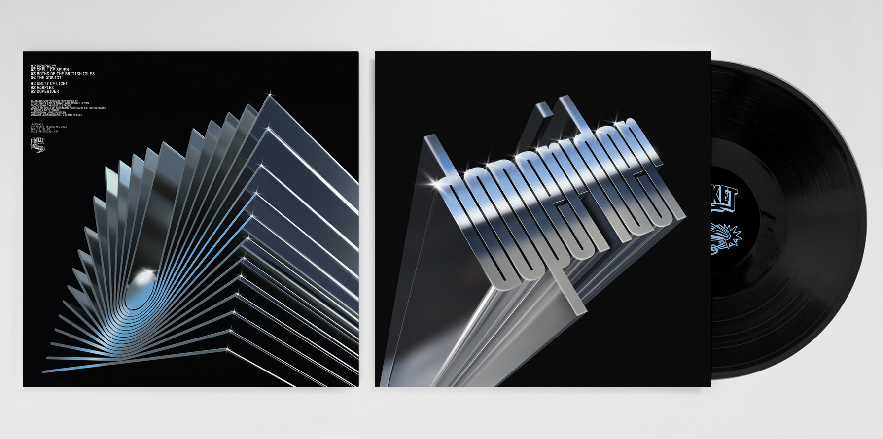
Hello. Please tell us about the brief and commission. John: Both Chris and I trained as graphic designers, and our roles are heavily intertwined with the visual art and the musical curation of Rocket Recordings. We take it in turn to design album sleeves unless a band requires us to source a specific artist. I also create a lot of music videos (including live AV / lighting), meaning Chris might design a few more sleeves.
We work hard to tailor each release in conjunction with the requirements of the musicians, the music diversity and genre jumping. Sometimes we collaborate as 'Chris & John', or singularly with other musicians, so it can vary. Sometimes it's a collaborative effort or sometimes solely on our own.
Often a band will have an idea for the cover artwork and, in some cases, they're open to how we interpret the music - which is incredibly trust worthy. More often, however, a musician or group has a clear idea of direction and we facilitate that. I think, for us, as the label owners and lovers of both disciplines, we are very lucky to be able to forge a career spanning music and art, that run side by side and feed back into each other.
With the Utopia Strong, the process has always involved letting the music assimilate into our minds, deciphering the music into some kind of art, and leaving it open for us to express it back to them. I designed all 3 albums (The Utopia Strong, International Treasure and Doperider) as well as the BBC Peel Sessions sleeve, a homage to the Peel Session releases over the years. The joke is that all the band names on the sleeve (different on the vinyl & CD) are made up and the members of The Utopia Strong had a wail of a time coming up with the fake names.
How did the music inspire the creative process?
John: The Utopia Strong have a warm Electronic sound with a 1970’s Krautrock ‘Kosmiche’ vibe, and we wanted to reflect that with a muted 3D retro disco style. For this release, the band put their trust in us. But when you drop a title like Doperider we felt there was only one way to go - be as loud and bold as possible with the words Doperider on the front sleeve, rather than hide away that title.
The title was taken from a Paul Kirchner compendium, Awaiting The Collapse comic about a psychedelic stoned skeleton on a motorbike. Paul’s character ‘Dope Rider’ (the skeleton in question) drives around the desert, getting into all manner of high jinx and spouting cosmic philosophy, highlighting the absurdities of life, death and the American mythos.
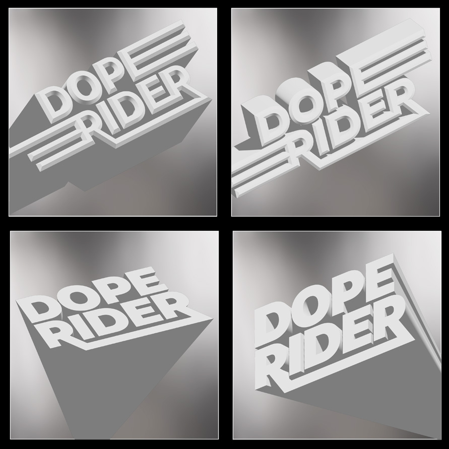
Our first approach was typographic. We experimented with different font layout designs and chrome, synth wave, and 80’s airbrush effects. Ultimately, the design direction leant into an illustrative approach.


What did you research when developing ideas for artwork?John: Inspiration came from 1970’s Electronic Krautrock album art, early Heavy Metal ‘chrome font’ logo’s, 1970’s soft focused chrome lens flare Disco sleeves (see above), but created in a more contemporary retro feel. We also shared some 1980’s airbrush logos from Metallica’s Ride The Lightning (above) and other chrome type fonts, which the band loved, and we decided on this direction very early on.
We always really like to nod to the past, but make it feel contemporary - rather than just copying artwork from our historic retro record collection.
Please share an insight into the design development.
John: I played around with a variety of font designs, to see if any off the shelf Synthwave chrome horizon text effects would be suitable. However, the results were unsatisfactory and we decided to build it from scratch. But, it was a good experiment to visualise what kind of chrome effect we were aiming for.The process started with selecting a variety of fonts that we felt represented the music and mood-board. Chris then customised a few designs to create some fabulous logos (which I experimented with using chrome font plugin’s) but they were for our reference, rather than for final use.
The best of these fonts were then taken into Illustrator and the 3D tool was used to extrude them in a variety of interesting axis and angles. We eventually chose a grey extruded customised font, which was signed off by the band, and became our main reference point.
The next part of the development was to export the illustrator file, with minimal extrusion in the asset, exported as a GLTF file, and opened in Adobe Dimensions. I then proceeded to rotate the angles on a various axis of the file, to closely match our previous Illustrator mock up, not exactly, but something that looked very strong.
Finally, adding in Dimensions surface material finish (shiny metal chrome with slight grain), adding additional light sources, and background effects, to get a desired three-dimensional approach of the font.
We also wanted to utilise the ‘The Utopia Strong’ logo on the back of the sleeve and in the same style as the front ‘Doperider’ logo font, which also needed to be rendered in 3D. So, I followed the same process taking it into Dimensions and playing around with the light, angles and surface materials.
Once I was happy with the finished work in the Dimensions ‘staging’ I exported by ray tracing the work to get that glossy 3D shine and opened the final design in Photoshop to add some handmade lens flair details, highlighted key-line’s and shadow blurs, before utilising some grain and soft focus, to really bring out the 1970’s / 1980’s mix vibe.
All these processes were repeated for the 2 digital singles artwork, the album poster art that came with the vinyl (consisting of a lot of the 3D 'The Utopia Strong' chrome logo cubes in various angles) and also the tour poster art too.
It took some work, to get it right to how we first envisaged it, and printed the final vinyl and CD using a UV Gloss finish to really make the whole thing zing. Thankfully, the band were delighted with the end results.
Design by John O’Carroll and Chris Reeder
Buy The Utopia Strong 'Doperider' vinyl here
© Transmission Publishing (2025)