Oto Hiax
Metals
Design by Ruben Buffery
Ruben Buffery is a graphic designer currently working at The Midnight Club, a 360 degree creative company, based in London, known for their original expression for cultural brands. We spoke to Ruben about the complexities of visualising the sound generated by a custom-made SPI instrument, which was used to create the 'Metals' album by Oto Hiax.
Released on Diagonal Records (2025)
Hello. Please tell us about the brief and commission. Ruben Buffery: I was commissioned by Oscar Powell (aka POWELL), a colleague at The Midnight Club who has co-owned Diagonal Records since its conception in 2011. Oscar and the rest of the Diagonal lot were looking for someone to design their latest release (Metals), and he kindly put me forward to Oto Hiax (Scott Douglas Gordon and Mark Clifford). It was the first time I was commissioned to design a physical LP. I've designed cassette tapes in the past, but this was an extremely exciting next step, since I love making anything physical.
The design brief was extremely open-ended, and I just had to make sure the artwork visually represents how the music sounds. The Diagonal Records output is fairly abstract and anti-design, and even though it was an open ended brief, there were parameters in the sense that the artwork needed to feel abstract enough to sit alongside their catalogue.
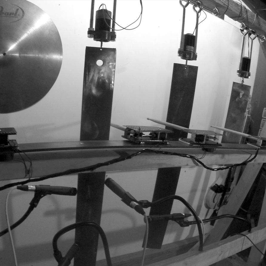
A couple of visual tools (see below) were supplied by the label and Oto Hiax. They both felt it was important to include an image of the SPI (spinning plates instrument), an instrument Scott constructed from industrial scrap metal bars, which are hung from a large vertical wooden frame, the metal struck by mechanical beaters driven by small motors. The SPI was a massive part of his process, and was used to record the entire Metals album, so I felt it should be part of mine, and is visible as a distorted image in the corner on the front cover artwork.
How did the music inspire the creative process?
Ruben Buffery: When listening to the SPI instrument, and looking at it visually, you can see where a lot of the visual cues came from for the artwork. Large, cold metal plates, with piercing yet somber sounds, supply so many feelings and sensations when experiencing the music. Chrome darkness and heavy artillery were key feelings when creating the artwork.
It might not be clear, but the entire artwork is a huge abstract typographic piece scripting the word 'METALS'. I created this almost illegible typeface, which is based on the sound and shape of the SPI. I wanted to completely embody the entire artwork and physical LP in the being of the SPI, almost as if the LP was another piece or fragment of the instrument that Scott created.
My aim was to represent the sound of the menacing vibrations of the record through the use of emotional typography. I initially started with a mixture of found typefaces that I printed out and distorted using scanner, fax and xerox techniques that I had up my sleeve. The final outcome is an amalgamation of type and sound representing what it feels like to look at and listen to the SPI.


What did you research when developing ideas for artwork?Ruben Buffery: The main source of research was listening to the record. Embodying the sound was key to the success of this project, and having other distractions and influences in the visual output felt unnecessary. I design things for large brands in my day job, which usually takes a lot of references from the past and things that have already been done before, so trying to distance my brain from that side of design felt important for this brief and output.
Please share an insight into the design development.
Ruben Buffery: I worked on a few iterations of the layout that featured the lettering covering the entire front and back LP in one continuous artwork, but we all agreed that it felt a bit tooooooo abstract! The colours felt clear to me from the start and were inspired by the chrome SPI plates. A muted chrome was used in the final outcome, to reflect the isolating SPI, and the deep feeling I had while listening to some of the tracks.To finish on printing, we pushed for an uncoated stock over a satin finish. I hate satin / glossy paper stocks and try to avoid them at all costs! I find that uncoated paper gives a bit more grit and life to anything printed and this felt so, so fitting for the final finish on the record.
Design by Ruben Buffery
Buy the 'Metals' vinyl here
© Transmission Publishing (2025)