Ray Fernandez
Zero Tolerancia
Design by Studio Mut, Thomas Kronbichler
Studio Mut is regarded as one of the most influential graphic design studios in Italy today. Thomas Kronbichler teaches Visual Communication at University of Bolzano and leads the studio together with Martin Kerschbaumer and Anni Seligmann. We spoke with Thomas about embracing technological flaws and the liberating rhythm of the cover design process behind Ray Fernandez's Zero Tolerancia double album.
Released by Zero Tolerancia Records (2025)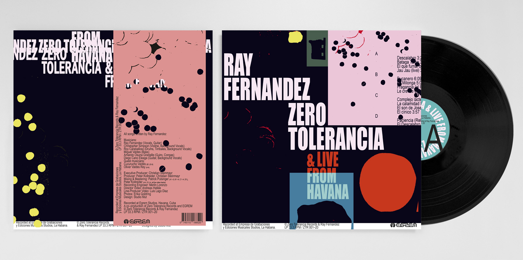
Hello. Please tell us about the brief and commission. Thomas: We hadn't heard of Ray Fernandez when we were first contacted by Andreas and Christoph (from the label) and the film team, so the project came as a complete surprise. They'd heard good things about us through a friend, and that’s often how we get new projects. We are nice to our clients and they say good things about us.
The brief was more of an informal chat with Andreas and Christoph. The project began during the pandemic, with our meetings taking place on Zoom. It was one of the first calls I'd ever had on Zoom. Can you imagine? Andreas and Christoph explained that they met Ray on a trip to Havana and fell in love with his music. Later, they returned with a film crew to capture him recording a full album. Alongside the film, they wanted to release the music on a double LP and asked us to design the cover.
They had full confidence in us. It’s strange to think back on that time now. At the time, though, it felt very natural. All of it did. During the pandemic, while we were stuck at home, it was a fata morgana, a dream project. I started by listening to the album, and continued for about 3 to 4 days, and watching a rough cut of the film, before even beginning to think about the design.
How did the music inspire the creative process?
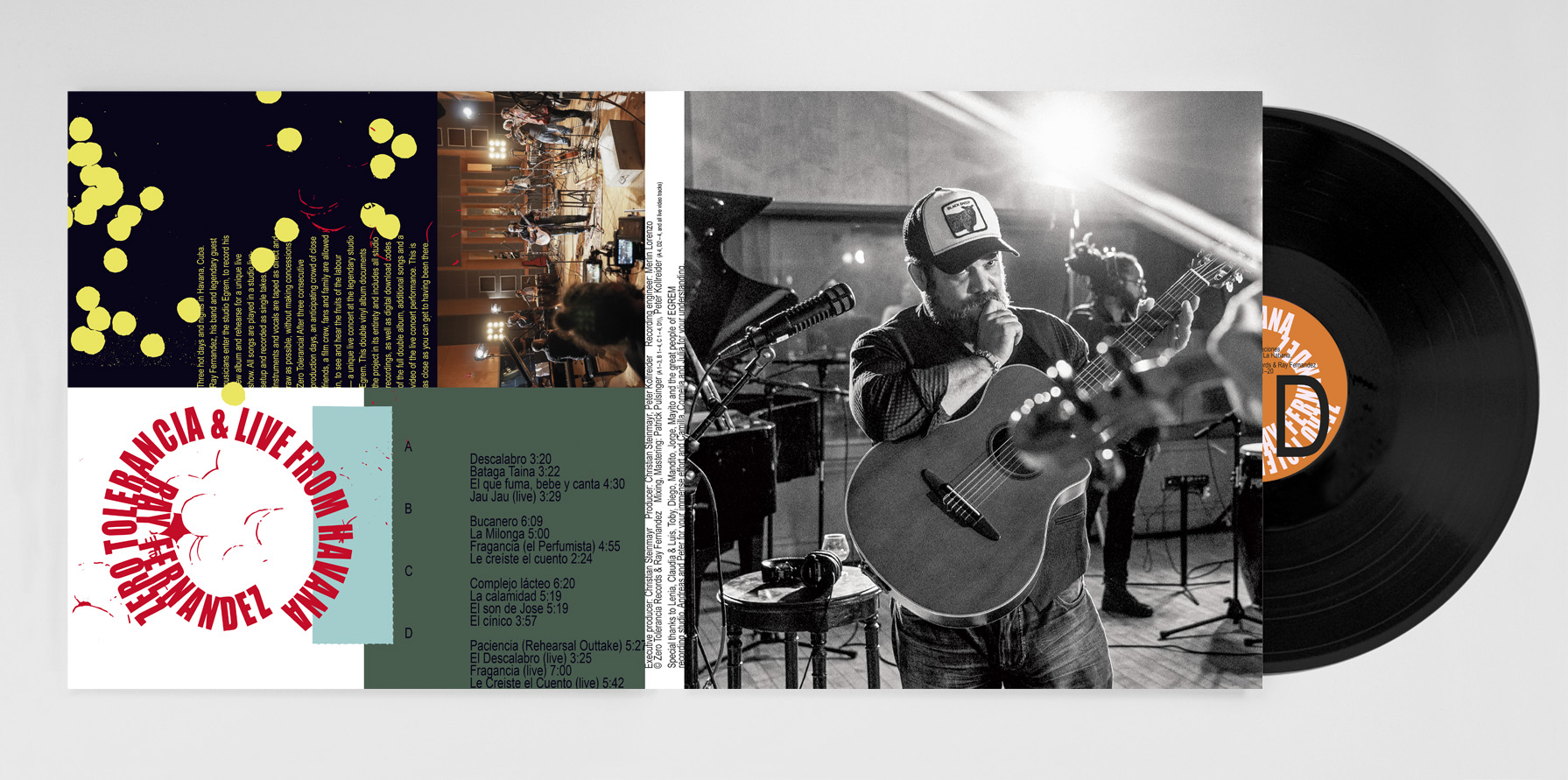
Thomas: It's a very afloat thing to say, but I feel the colours and the rhythm of the layout reflect the music. I spent a long time working on colour balance. The interplay of graphical elements, the dance of the type and colours, that became my instrument. The notes come from the colours and the colours came from a feeling, not a calculation. At the time, it felt very right, and I followed that instinct.
As a designer, you must listen to two parallel thoughts. One thought is of the Genius: I see what others cannot see. If you block that thought, you cannot create great things. The second thought is of the Critic: If you don’t question design, it has no foundation, and the viewer will get lost. Without the critical thought, you can never grow as a designer, because the Genius thinks that everything it creates is good right away.
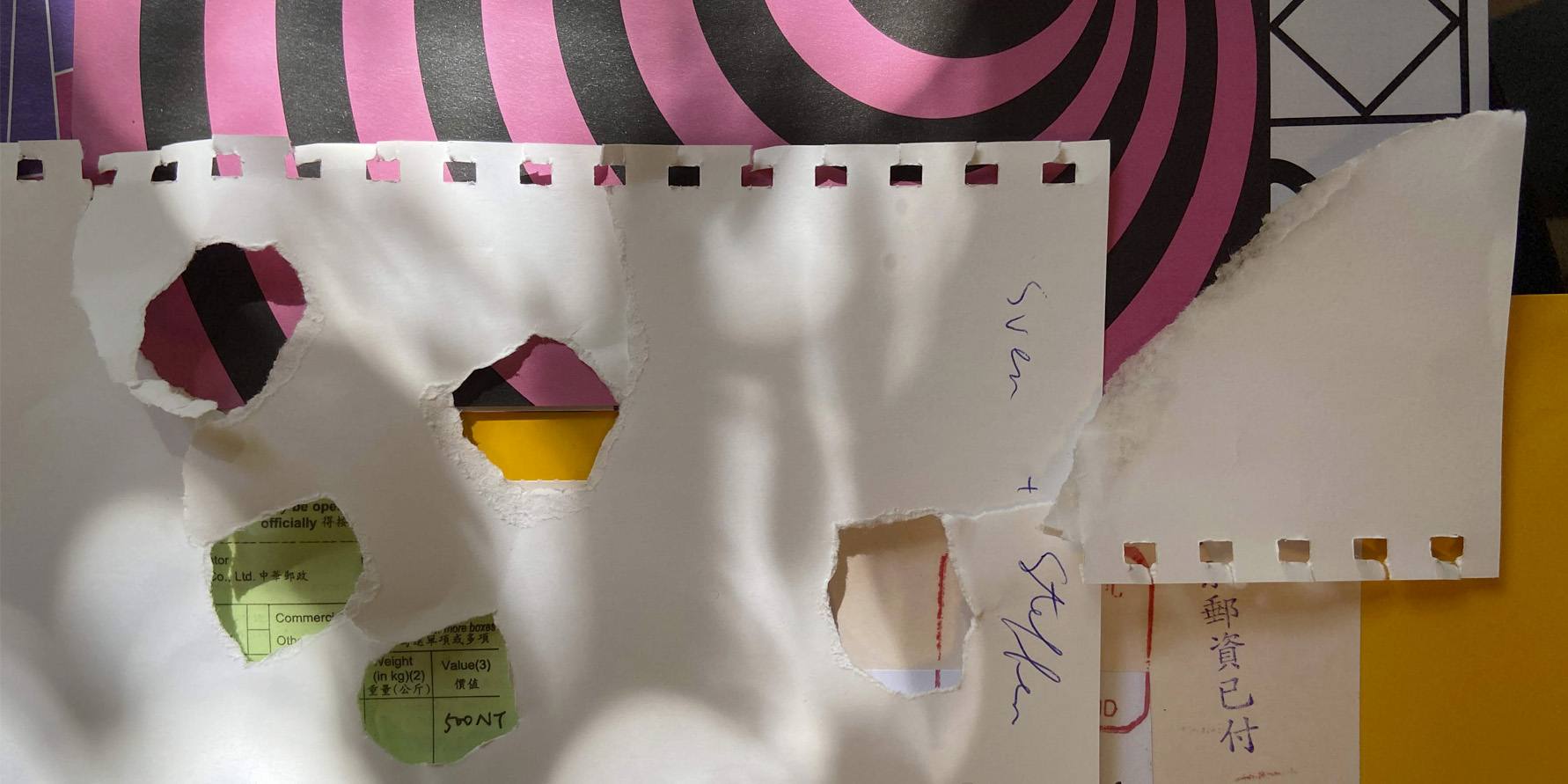
What did you research when developing ideas for artwork?Thomas: For as long as I can remember, I've always needed a studio to do design work. I never worked from home, on trains, or in hotel rooms. The design studio was the place where everything I need was at hand: materials, computers, inspiring books, great design, and, most importantly, the company of other designers.
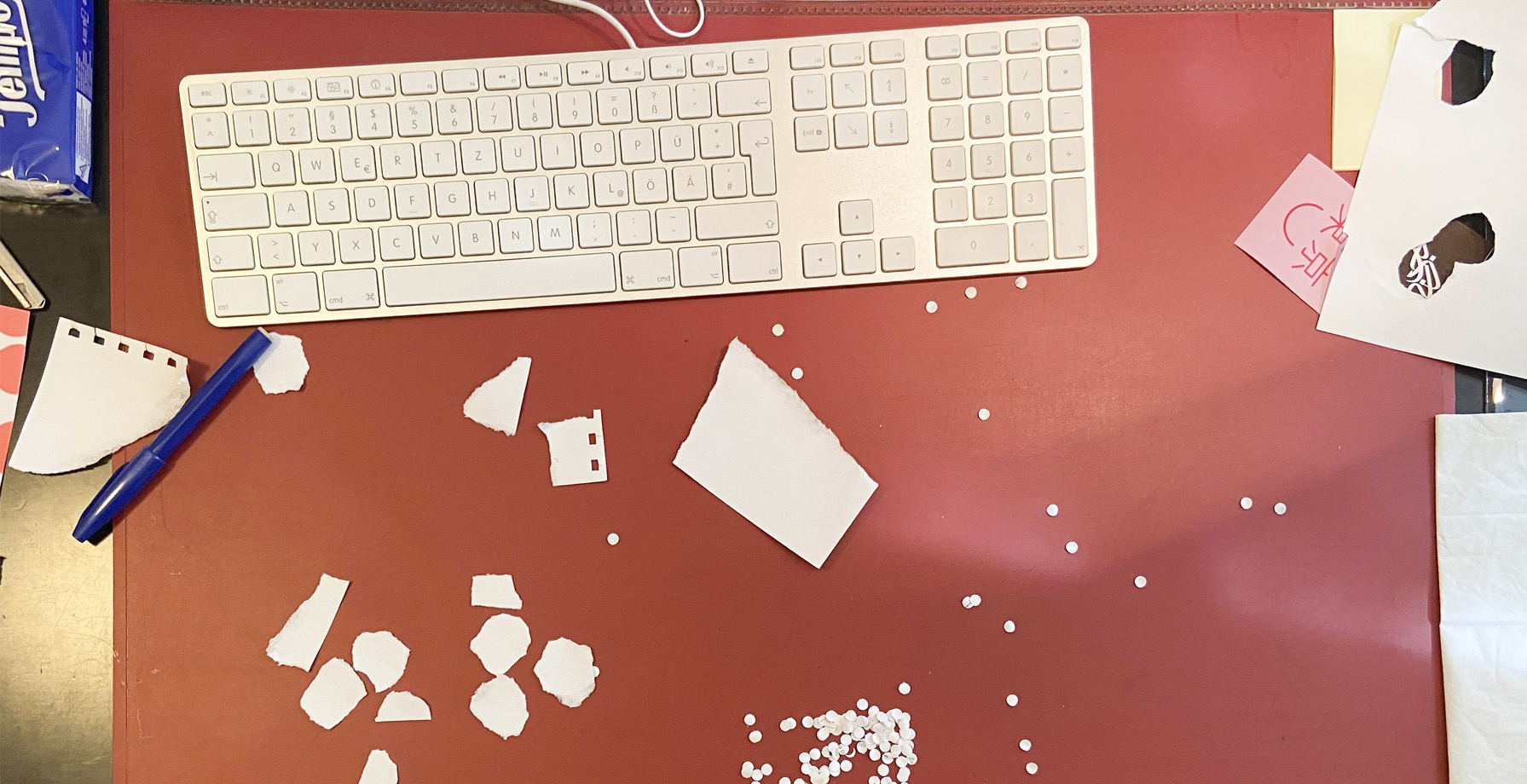
This project, however, was made during the Corona pandemic lockdown. The whole of Italy was confined to their home. So I used whatever I had on the table: pieces of cut and ripped paper. I took bad iPhone photos, digitised them and experimented. The result is a truly strange mix of analogue and digital collage. The final design is in vectors, and very flat, and although the layout is quite precise, actual pieces come from a rougher world that is not digital.
Please share an insight into the design development.
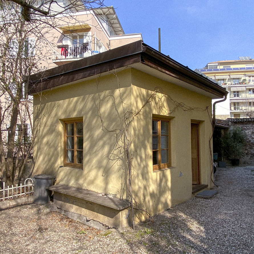
Thomas: For this project, I used Affinity Publisher. It's a new software, not Adobe In-Design or Illustrator, which is the industry standard, and is by no means the standard software. It has difficulties rendering type as cleanly as In–Design, but I leaned into that flaw and deliberately stretched the typefaces. The main typeface I used is Arial. I like Arial, because it doesn't pretend.It was a very fun project: a great client, fantastic music and all during a time where everything stood still. No cars on the road, working in the garden studio (pictured above) of my father, starting with nothing more than some ripped paper.
Design by Studio Mut, Thomas Kronbichler
Photography by Erika Goldring
Buy Ray Fernandez 'Zero Tolerancia' double album vinyl here
© Transmission Publishing (2025)