Nils Frahm
Paris
Design by Studio Torsten Posselt
Studio Torsten Posselt (STP) is a Berlin-based multidisciplinary design studio known for its refined approach to art direction, creative consultancy and design across editorial, branding, packaging, and spatial installations. We spoke with founder Torsten Posselt about the delicate balance of visualising cultural identity and avoiding cliché in his design for Paris, a live recording by Nils Frahm at the Philharmonie de Paris.
Released by Leiter Verlag (2024)
Hello. Please tell us about the brief and commission. Torsten: My collaboration with Nils goes back many years. I’ve been responsible for the majority of his album covers, along with a range of other design-related aspects. That history of working together has created a kind of friendship, which naturally carried into this project.
The music for Paris was recorded in a single night at the Philharmonie de Paris. Having attended so many of his live performances, I already had a clear sense of the atmosphere the album might convey.
There was no formal brief, which essentially gave me carte blanche — an ideal starting point. After a brief discussion about the record, it became clear that we shared the same perspective. From there, I took the lead. Because I also designed the Leiter label identity, I knew exactly how the artwork needed to align with both the artist’s and the label’s visual world.
How did the music inspire the creative process?
Torsten: Initially, my ideas revolved around French cultural stereotypes — whether in fashion, food, or other real or imagined associations. I was intrigued by the potential risks in those directions. The results could have felt uninspired, overly humorous, or even offensive, so the challenge was to navigate that fine line.
In general, I want my artwork to be iconic, simple, and immediately recognisable. This project was no different, but it also required a subtle, playful twist.


What did you research when developing ideas for artwork?Torsten: Every project is different, but my primary source of inspiration is usually speaking directly with the artist. That conversation provides a sense of where they are coming from and sets the tone for the creative process.
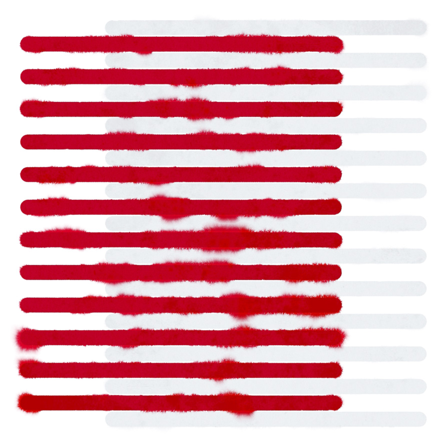
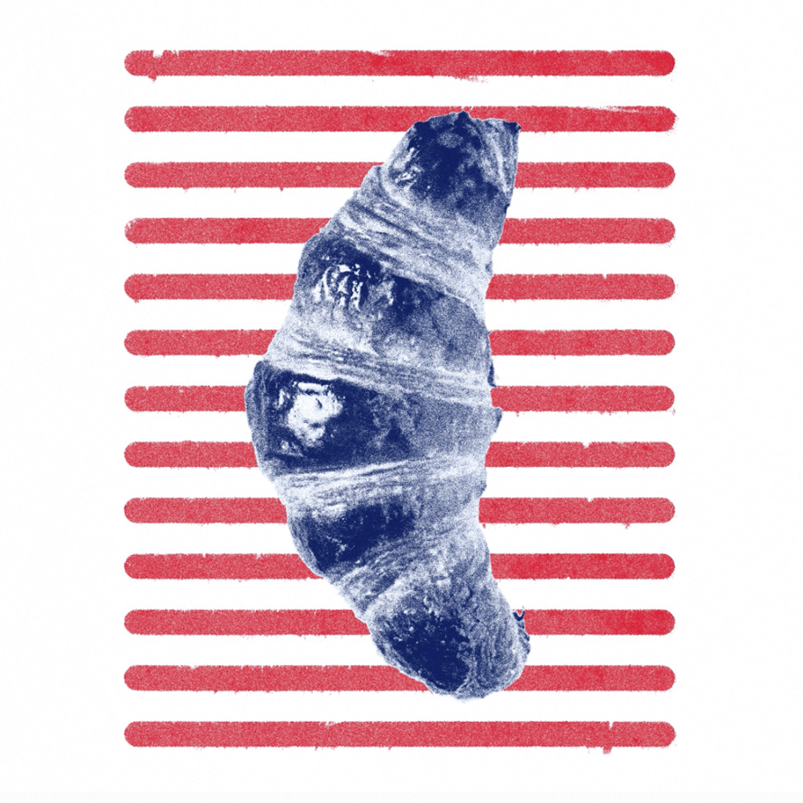
With Nils, that step is unnecessary — our long-standing collaboration means I can move directly into developing visual ideas. For this project, I looked into familiar French references: striped patterns associated with the “Onion Johnny,” or culinary staples such as cheese, wine, snails, and pastries. Essentially, I explored the kinds of visual elements that might fulfil a recognisable French stereotype.
Please share an insight into the design development.
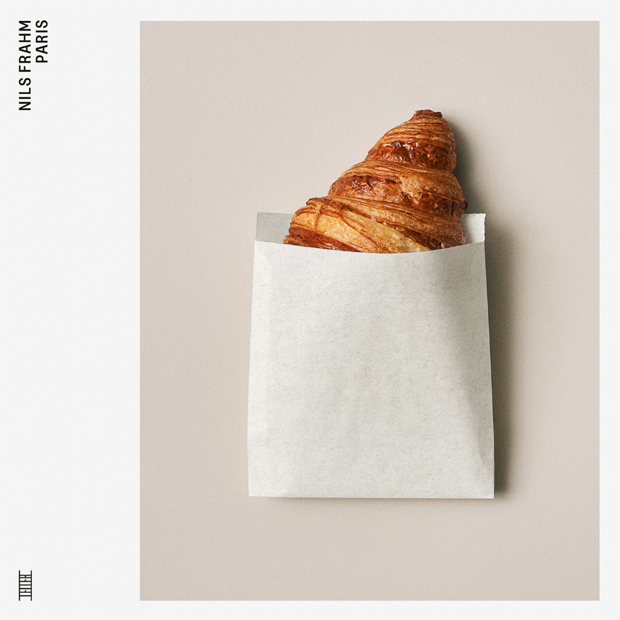
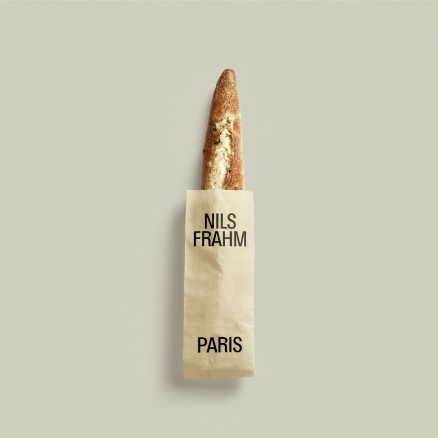
Torsten: I rarely develop just one visual concept. Here, I explored roughly twelve different directions, ranging from abstract colour compositions to bold typographic treatments, before arriving at a set of sketches that incorporated baguettes and croissants.That last idea immediately resonated with Nils and his team. We quickly realised that the imagery needed to be strong, simple, and deliberately imperfect. I didn’t want it to resemble high-end food photography, or feel overly detailed. Instead, I approached it almost like a pared-down design mockup: a plain background, a paper bag, and a single croissant as the central figure.
The remainder of the process was straightforward, both in terms of capturing the final image and producing the physical album cover.
Design by STP
Buy Nils Frahm 'Paris' vinyl here
© Transmission Publishing (2025)